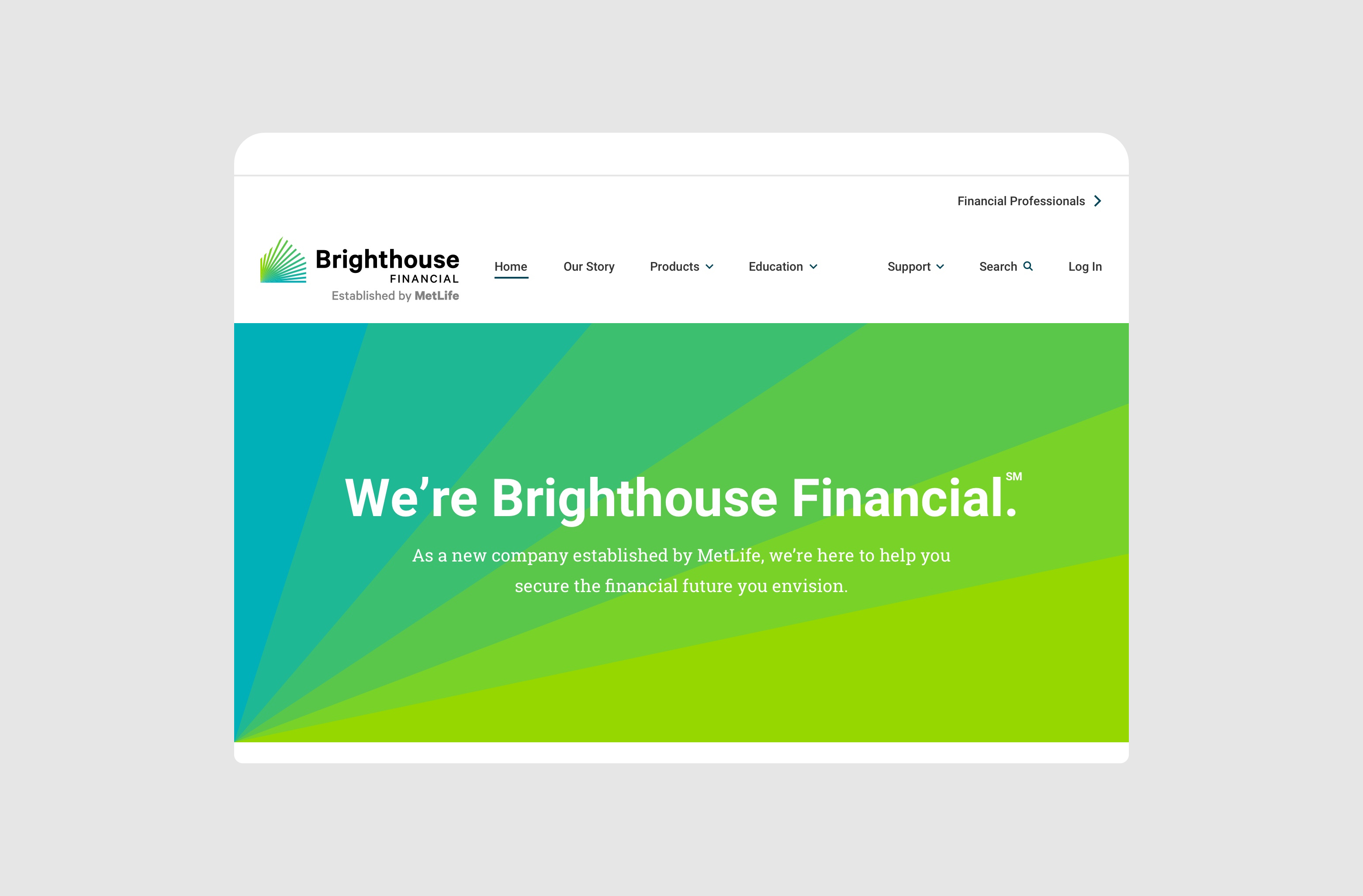
Brighthouse Financial is a MetLife company dedicated to retirement planning. I helped them envision and design their first website for the launch of the company in 2017.
RedPeak is a branding agency in New York and Taipei that was looking for a new website. Their redesign focuses on a more curated approach that shows RedPeak’s best work and highlights their unique personality.
In 2018, MoveOn.org was looking for a brand refresh and a new site. I designed the information architecture and key pages for the site, merging three separate websites into one cohesive home for the nonprofit.
In 2018, MoveOn.org was looking for a brand refresh and a new site. I designed the information architecture and key pages for the site, merging three separate websites into one cohesive home for the nonprofit.
Problem
In addition to introducing the new company, I focused on solving problems people encountered while planning for an uncertain future and sorting through the jargon of financial products.
Role
I led the experience design of several interactive tools and led the design of the website with another designer. I mapped the user journey, analyzed competitors, organized the architecture, and created directions, wireframes, and prototypes for the site.
Discovery - Determining the Focus
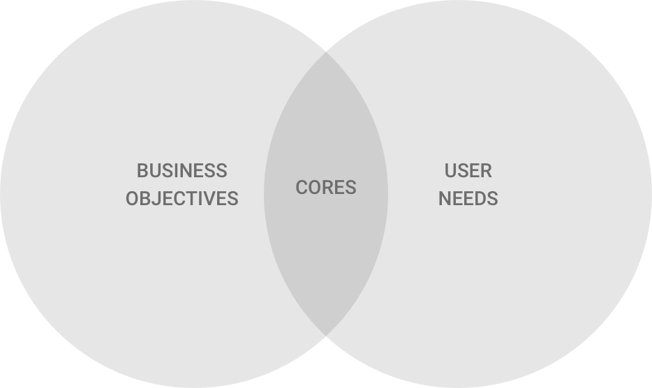
At the highest level, my process centered around the alignment of business objectives and user needs. This overlap, examined for each phase of the user journey, revealed key areas of focus for solving the most important problems.
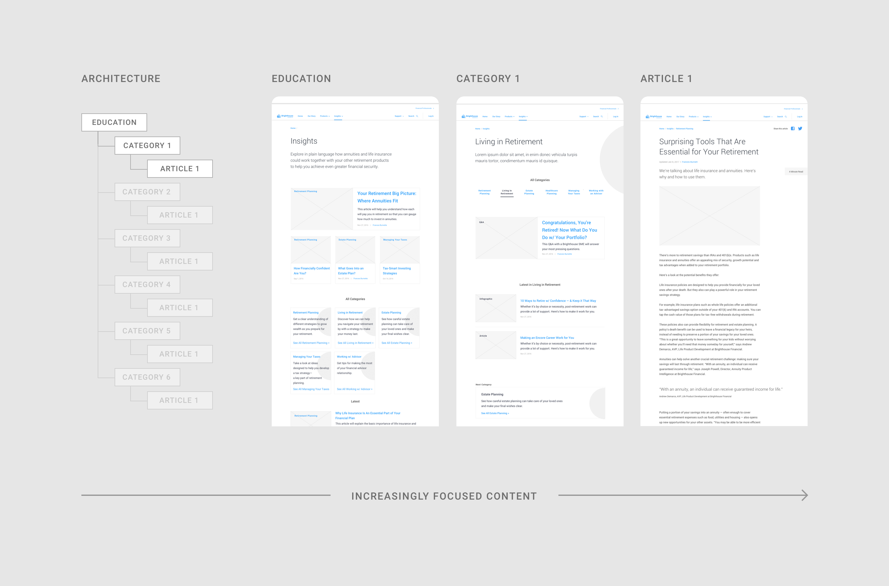
This prioritization informed the hierarchy of sections and pages in the site architecture. Content was compared, and related sections, like educational tools and articles, were grouped together.
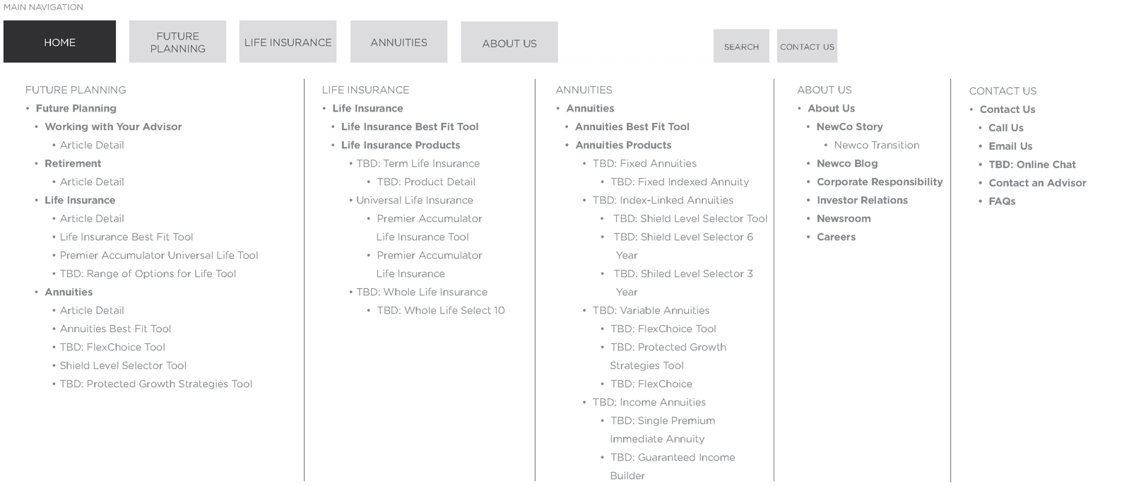
I worked closely with content strategists to create the architecture of the site. I designed the wireframes of the menu iteratively, and tested several prototypes with users.
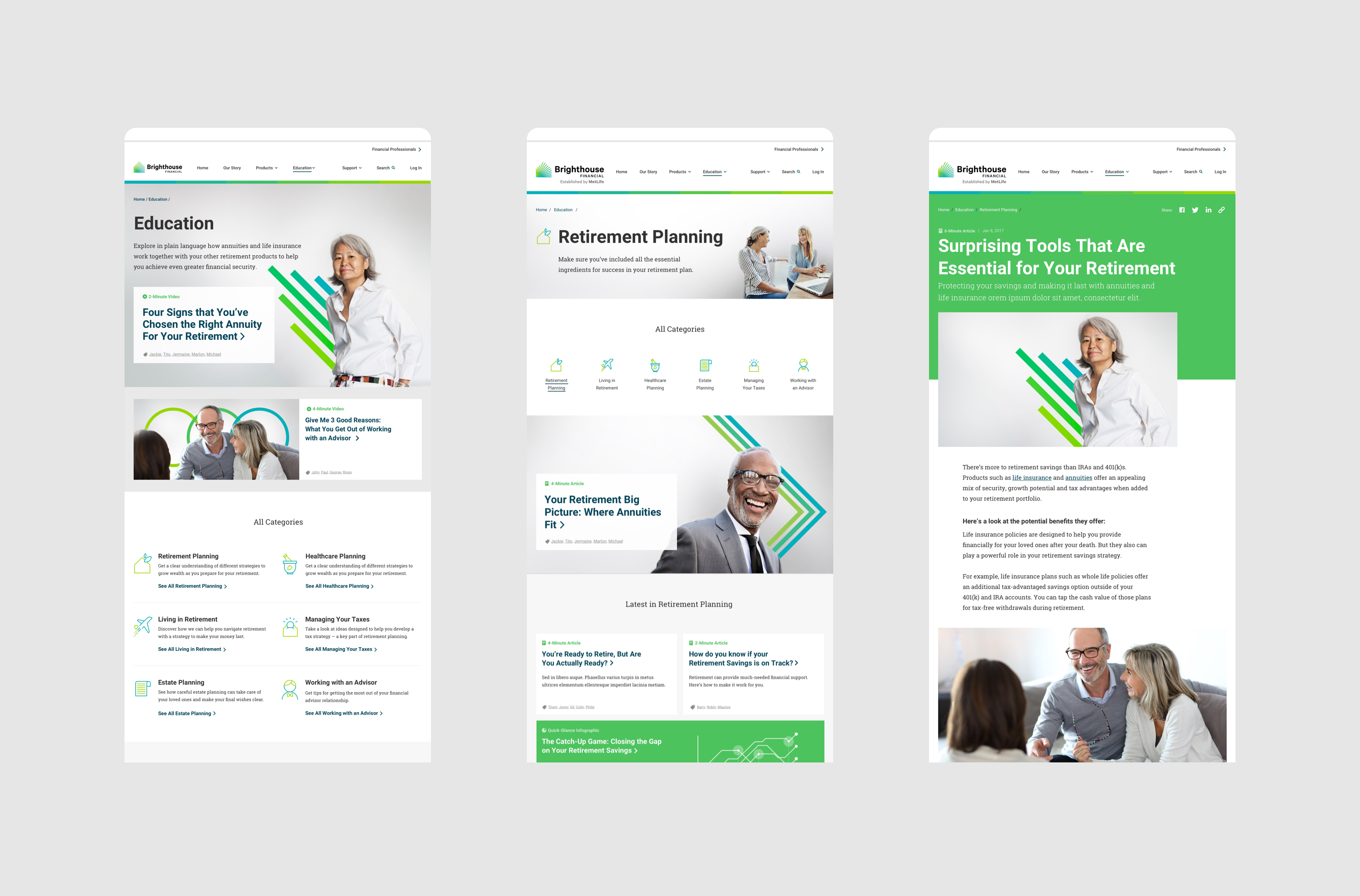
Education - Planning for Retirement
As part of their commitment to financial independence, Brighthouse offers an extensive content library to educate visitors and help them find the right products. This journey was considered in relation to the sales funnel, informing how users move from the broader, more general pages to more specific ones like information on purchasing a product.
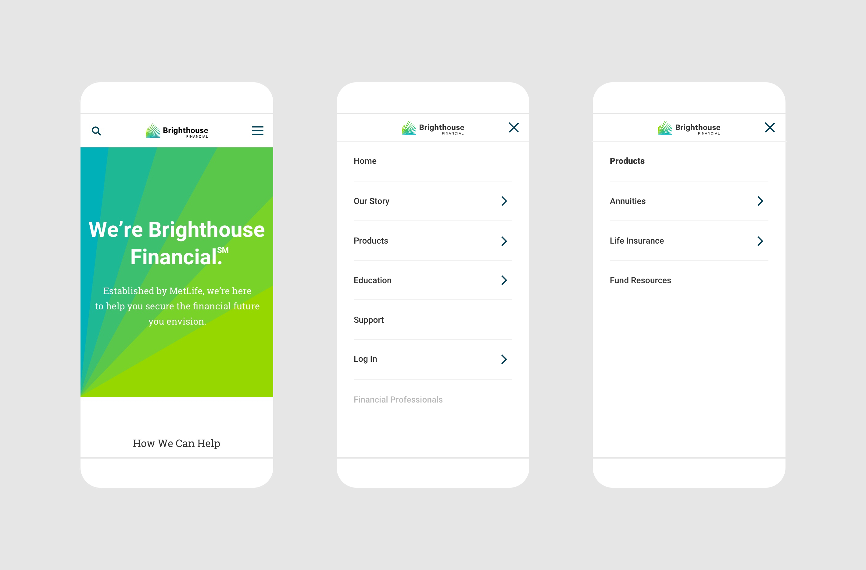
Home - Introducing the Basics
As the first stop for most new visitors, the homepage acts as the introduction to the website and to Brighthouse Financial as a brand. The design communicates the Brighthouse mission of financial independence, then supports this mission with related products and content, reinforcing the brand while communicating the main sections of the site.
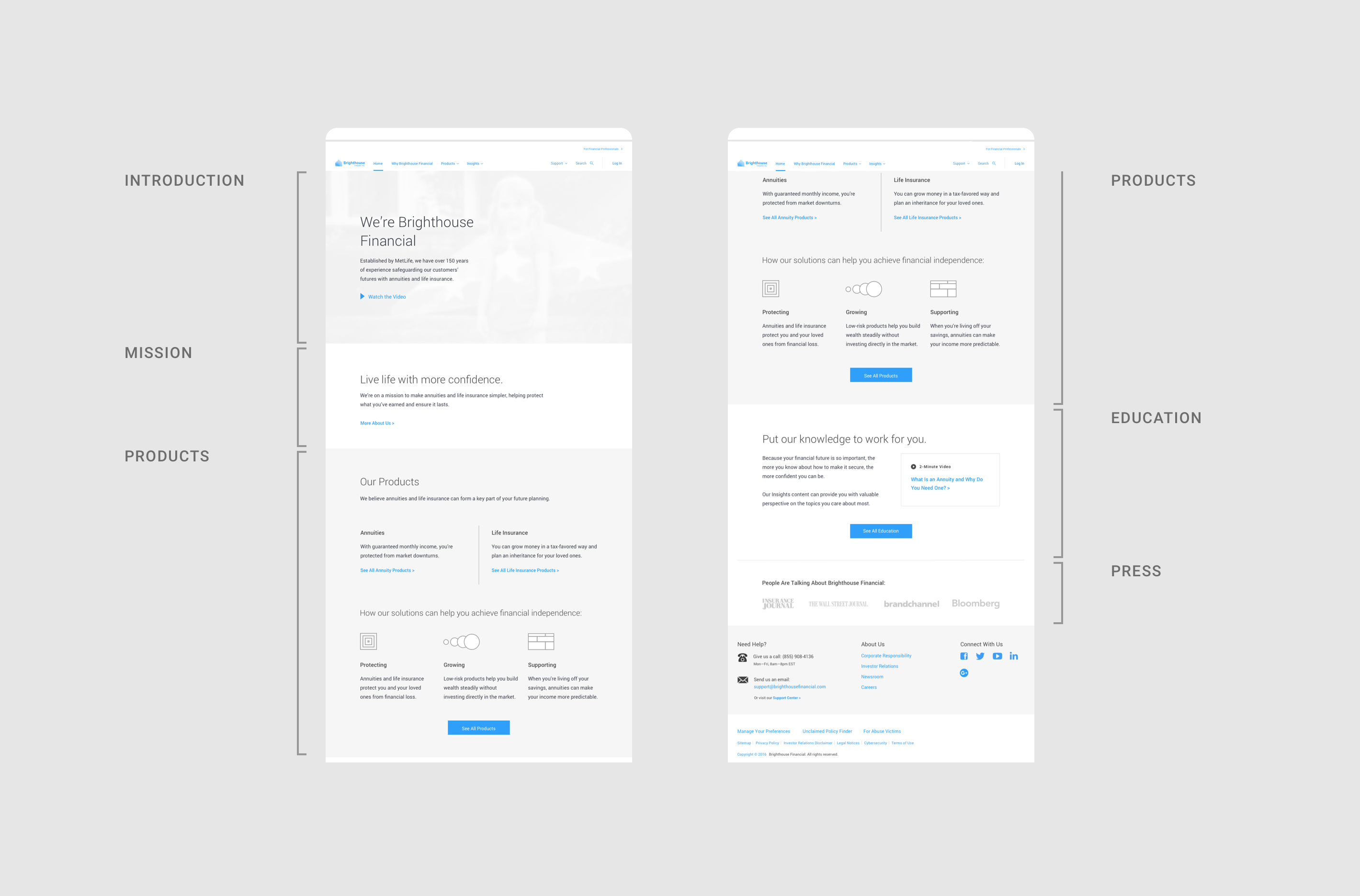
Products - Finding the Right Fit
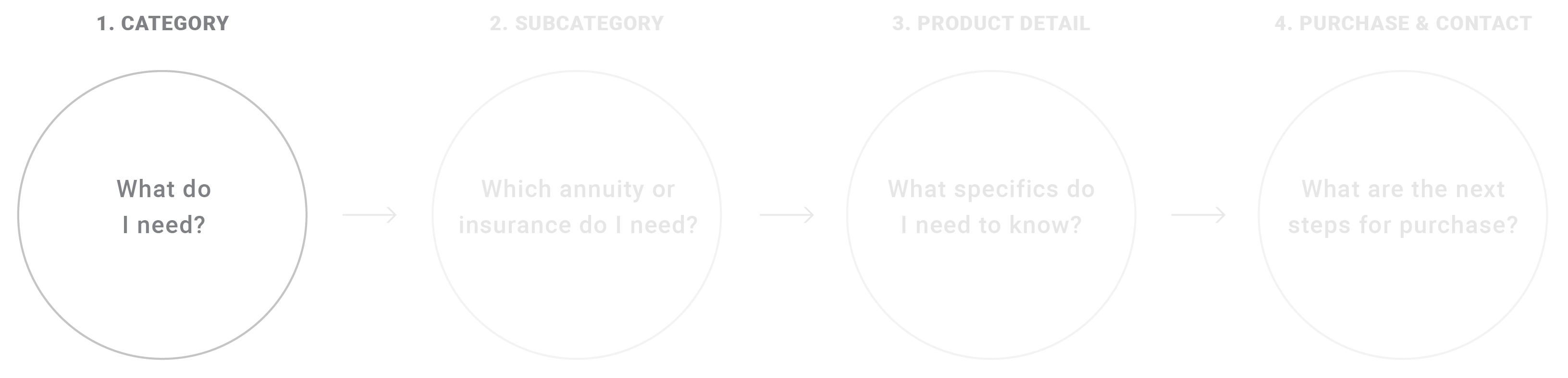
Research showed our target audiences had trouble differentiating between financial products. Traditionally, users had to read the details of every product in order to get any sense of how they fit their needs. Users were also wary of recommendations when it was unclear how a tool came to a conclusion.
To ensure I was making appropriate recommendations, I researched every category of life insurance and every policy offered. I then compared these offerings side-by-side and mapped out the key differences between each type.

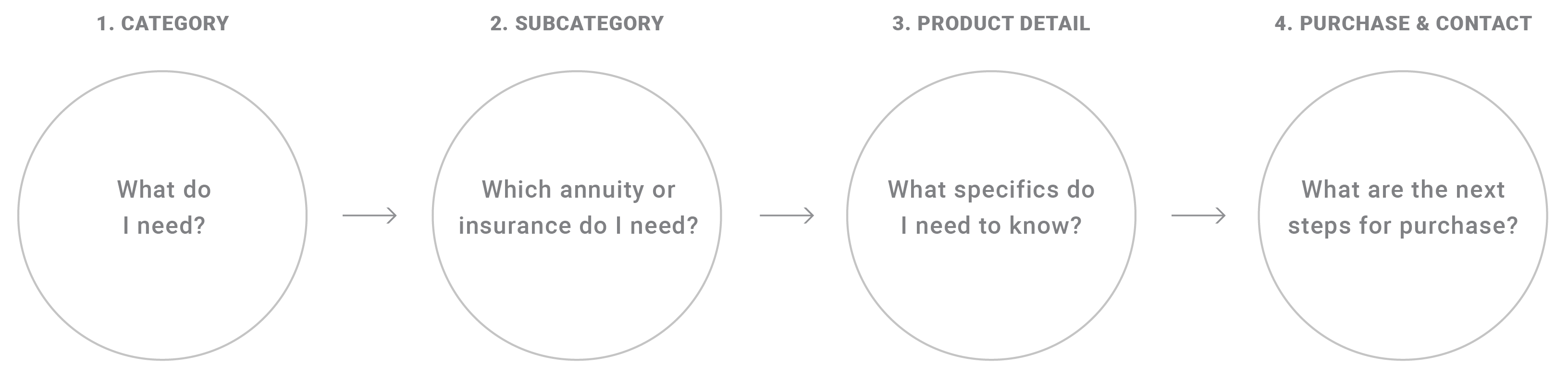
As I mapped these differences, it became apparent that these were critical choices for users. It also became clear that by following a single path on the map, users avoid unnecessary details of irrelevant products and can stay focused on their decisions.
An early prototype explored a ‘decision-tree’ that provided transparency into the differences between products.
Users make decisions between succinct questions, but additional information is just one click away, helping them stay focused without omitting important information.
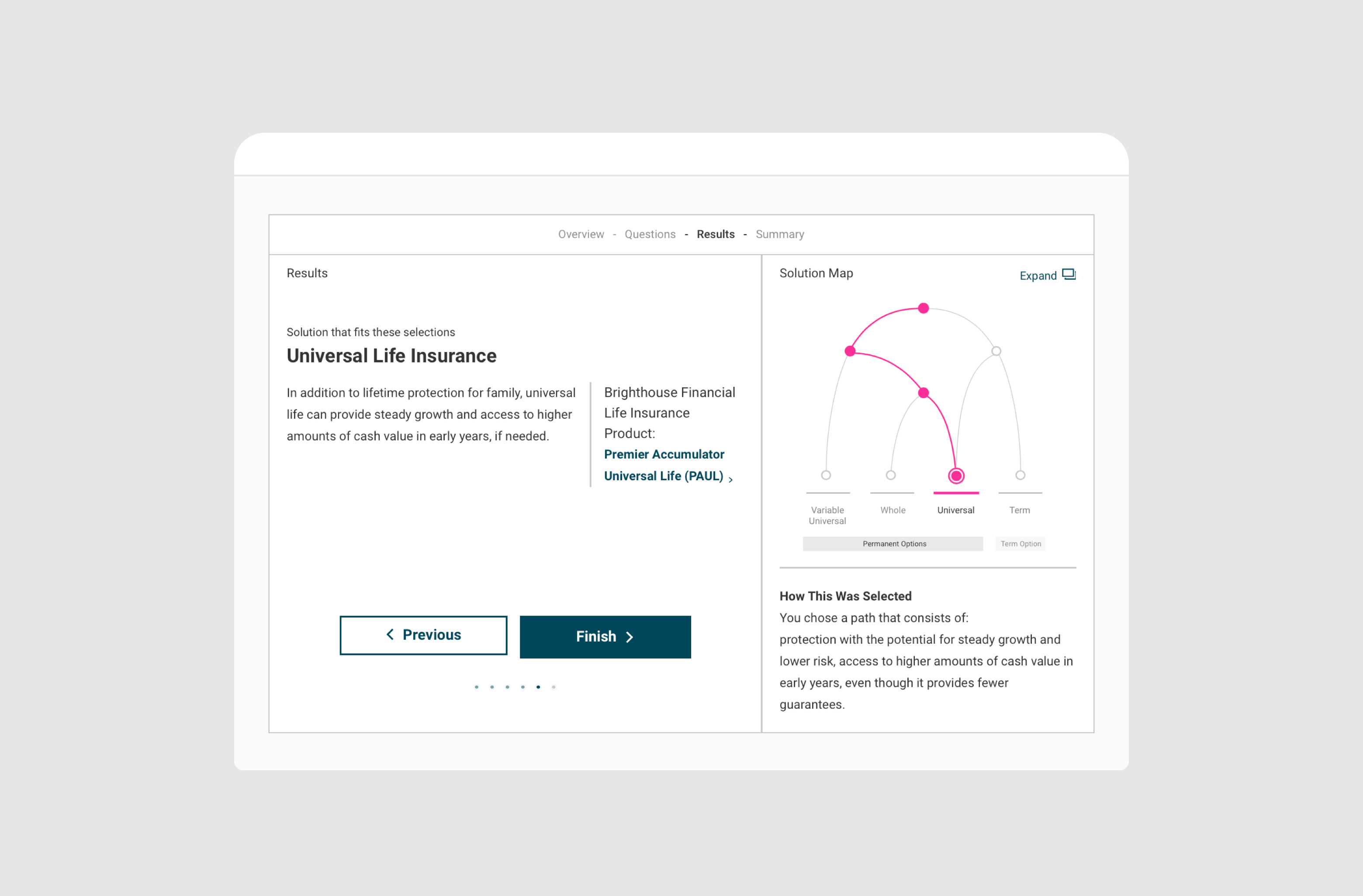
The tool helps users move easily through a few short questions to a product recommendation, all while making it easy to compare alternatives.
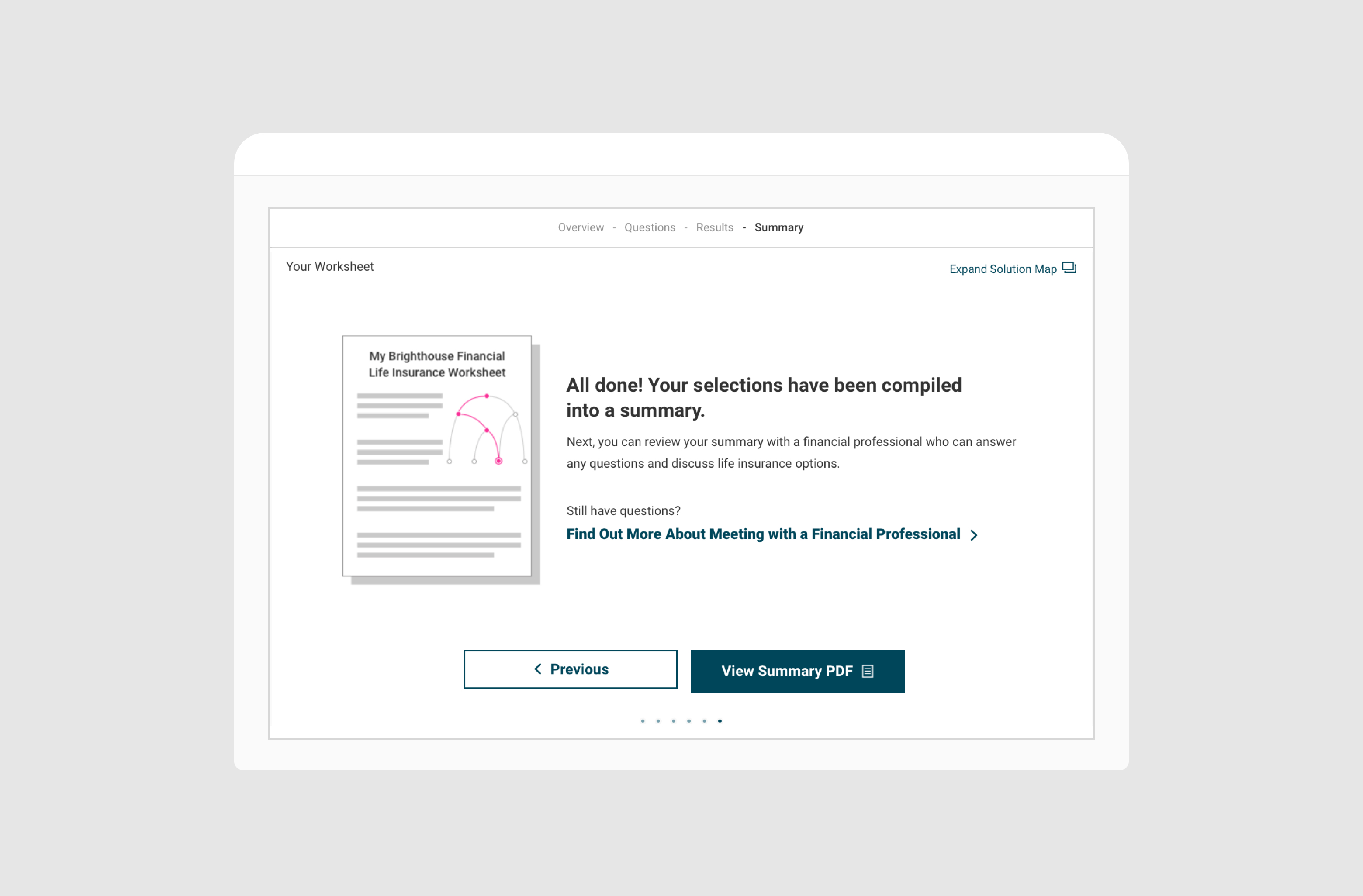
After exploring product options, users can download a summary of their decisions and recommendations, helping bridge the gap between research and making the final purchase with an advisor.
Launched in 2017, the corporate website moves users through a funneled experience, providing everything from general advice down to specific product recommendations and educational information.
See more at brighthousefinancial.com
Other Projects