RedPeak is a brand and experience design agency. As their lead experience designer, I redesigned their website to better reflect their work and personality.
RedPeak is a branding agency in New York and Taipei that was looking for a new website. Their redesign focuses on a more curated approach that shows RedPeak’s best work and highlights their unique personality.
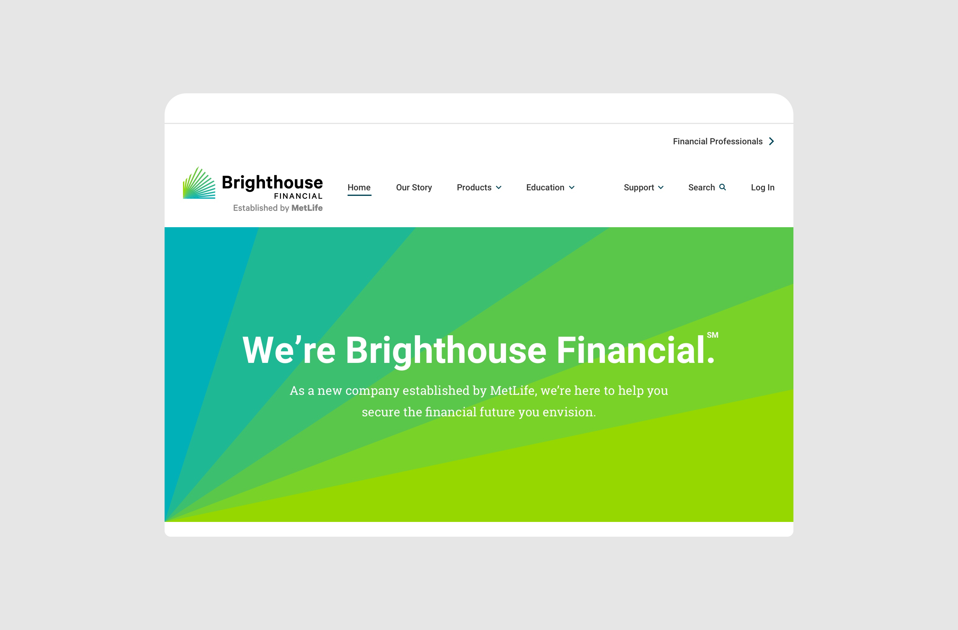
In 2018, MoveOn.org was looking for a brand refresh and a new site. I designed the information architecture and key pages for the site, merging three separate websites into one cohesive home for the nonprofit.
In 2018, MoveOn.org was looking for a brand refresh and a new site. I designed the information architecture and key pages for the site, merging three separate websites into one cohesive home for the nonprofit.
Problem
RedPeak was looking to refresh their site to better showcase their work. I focused on the experience visitors have as they discover the company, explore the work, and ultimately get in touch about a new project or open position.
Role
I led the experience design with the help of an art director while managing a junior experience designer. I audited the existing experience, mapped the user journey, analyzed competitors, and organized the site architecture, all of which informed my directions and prototypes.
Discovery - Outlining the Problem
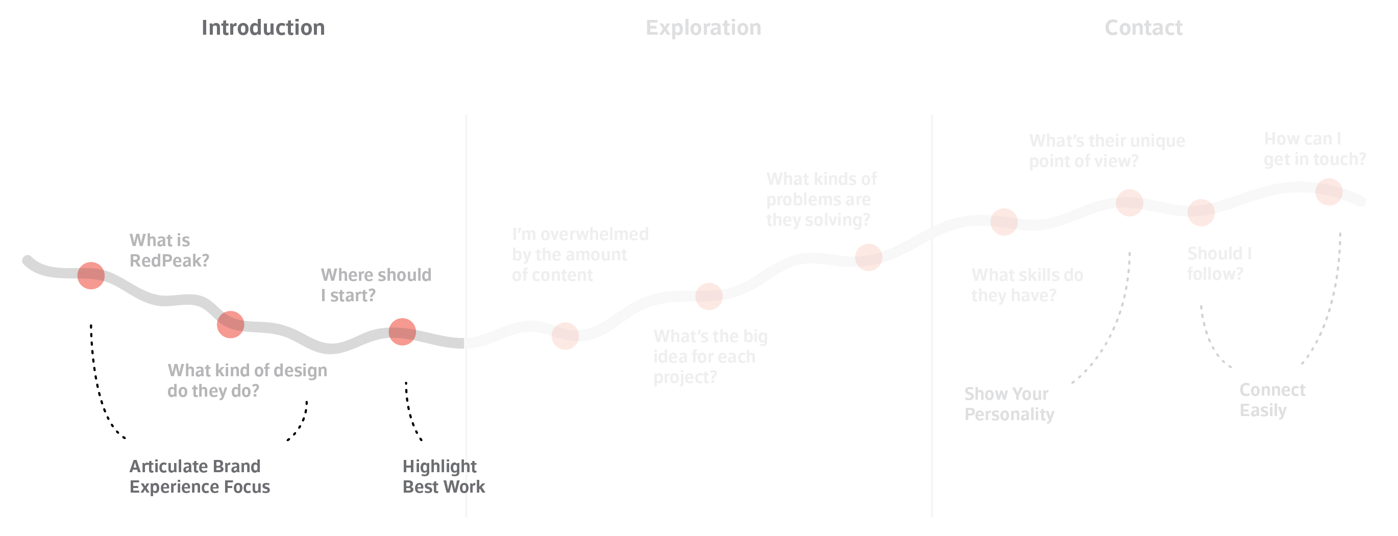
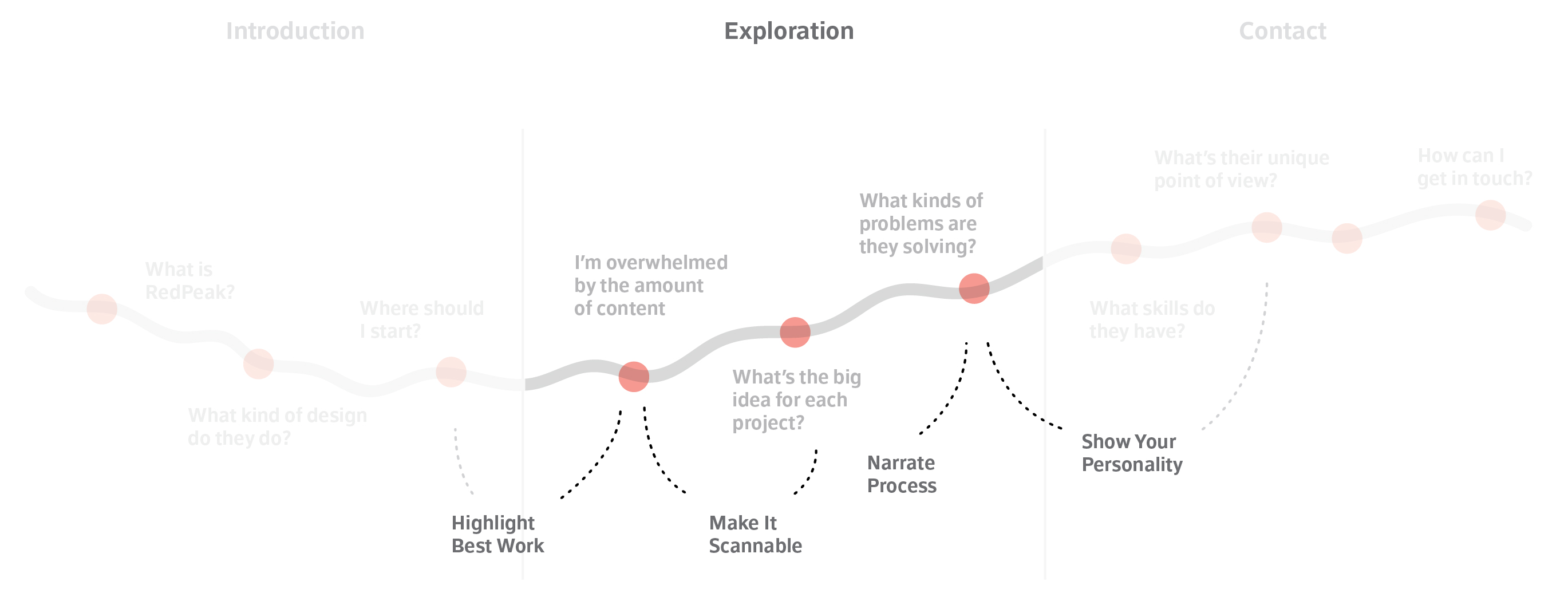
I began by looking at the existing experience. By speaking with key stakeholders and other departments like business development, I uncovered the issues that trouble the visitors of the website.

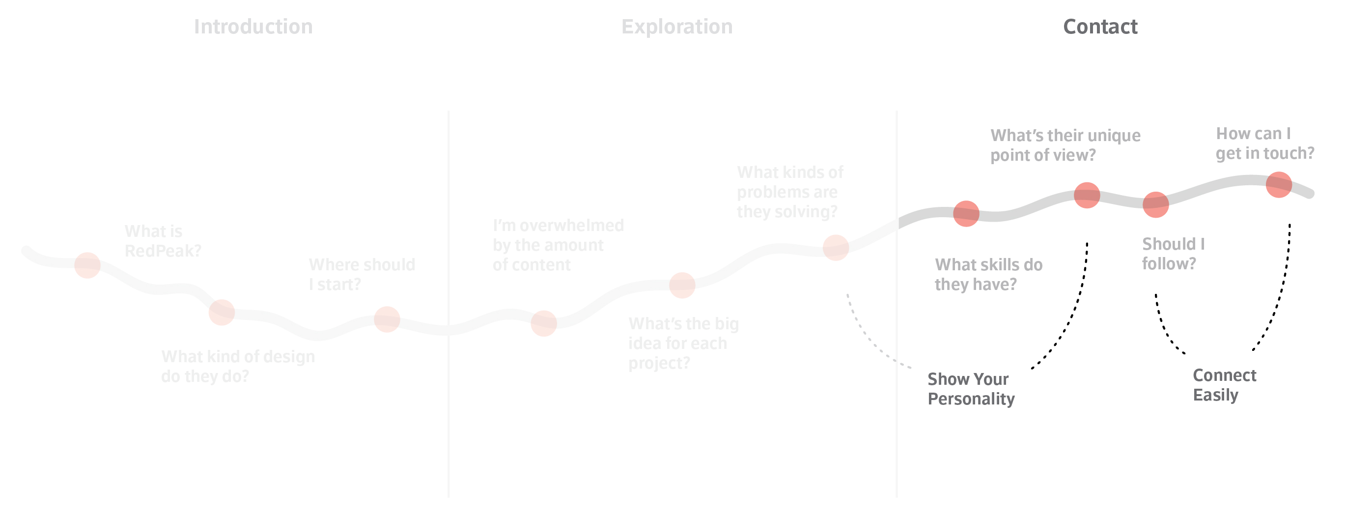
These issues were synthesized into a user journey map, focused primarily on potential clients and job applicants. The map follows users from their introduction to the site, through their exploration of the work, and ultimately to making contact with RedPeak.
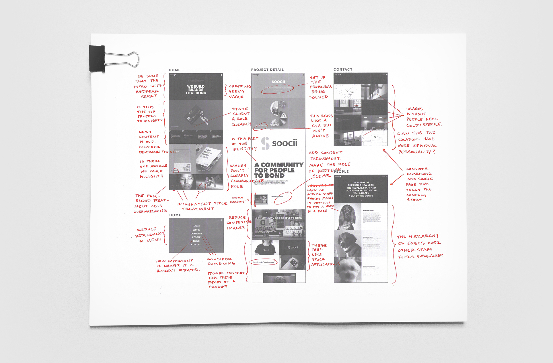
I audited high-traffic pages of the existing experience to highlight issues with the strategy, design, and build of the site.
Exploration - Determining the Direction
Our initial discovery research lead naturally into our exploration of concepts. Each member of the team owned a direction, and worked together to expand and differentiate each one.
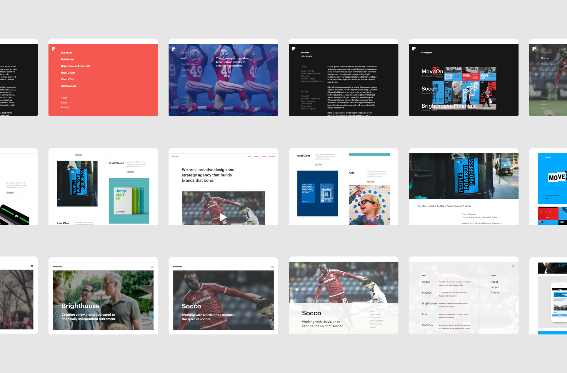
Each direction focused on a different way of exciting visitors with a compelling introduction and engaging them further with examples of the agency's best work.
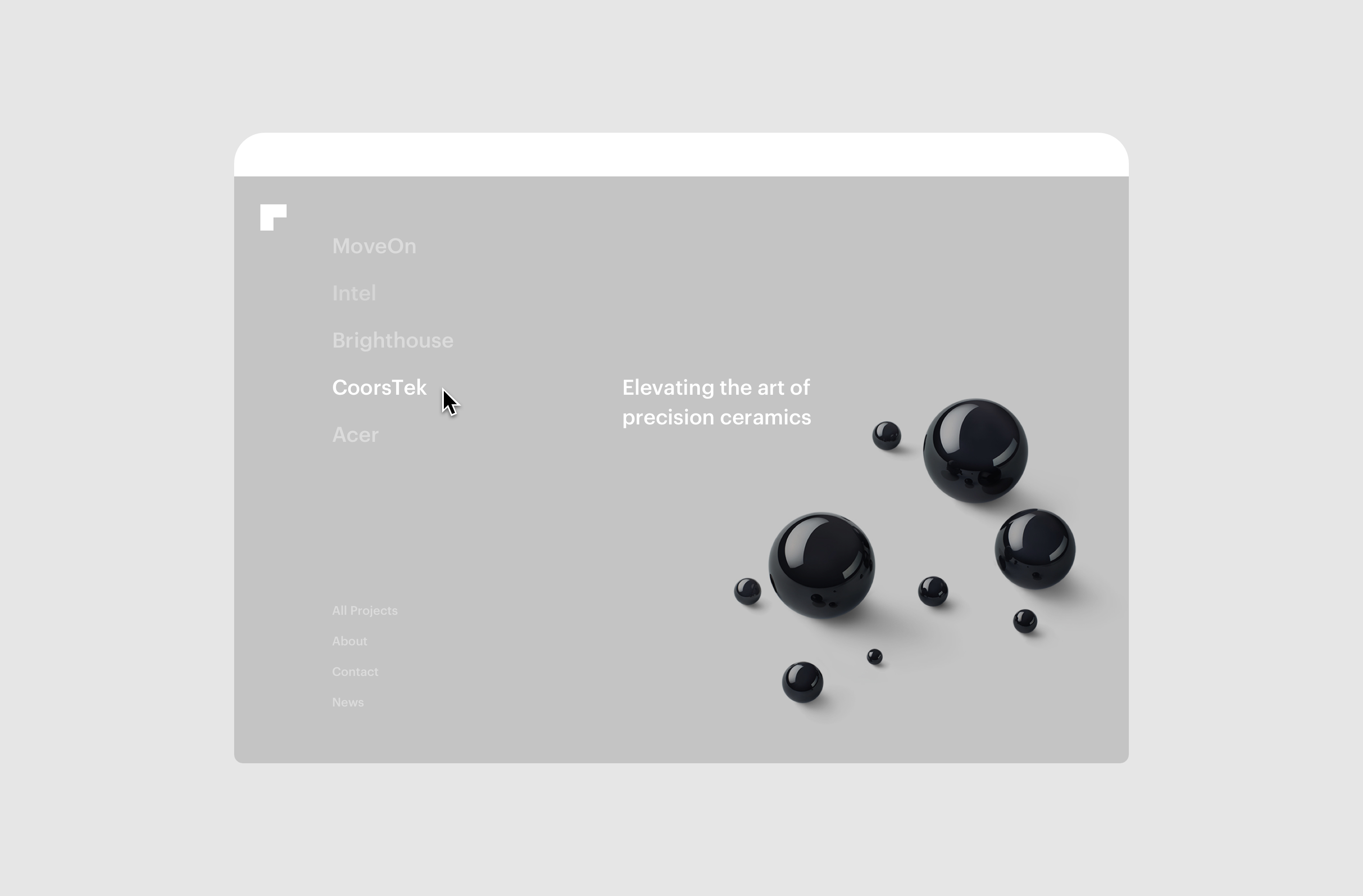
The final direction focuses on a bold, graphic homepage that highlights RedPeak's top five case studies. This homepage acts as a menu, simplifying the architecture and providing a hierarchy that guides users to the best work.
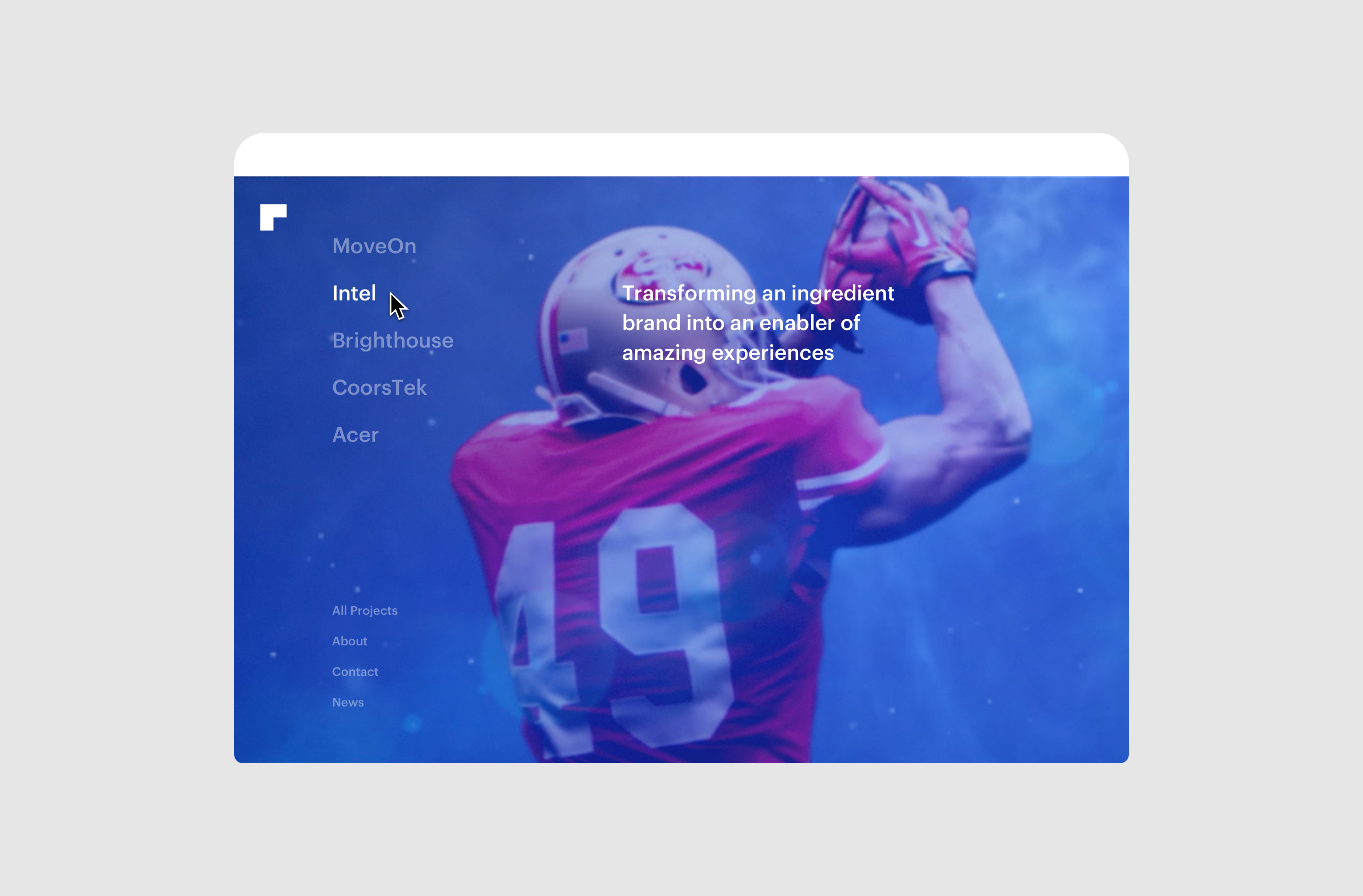
Each menu item reveals a video on hover, teasing the contents of individual projects and sections.
Projects - Telling a Focused Story
For the individual project pages, we focused on telling a stories that were focused, visually engaging, and could be easily scanned for the main points of interest.
The audit of the existing experience revealed that the current site templates scaled poorly on small devices, making text illegible and images difficult to see. Our redesign scrapped the current templates and built a completely new responsive framework, complete with guidelines for designers updating the site.
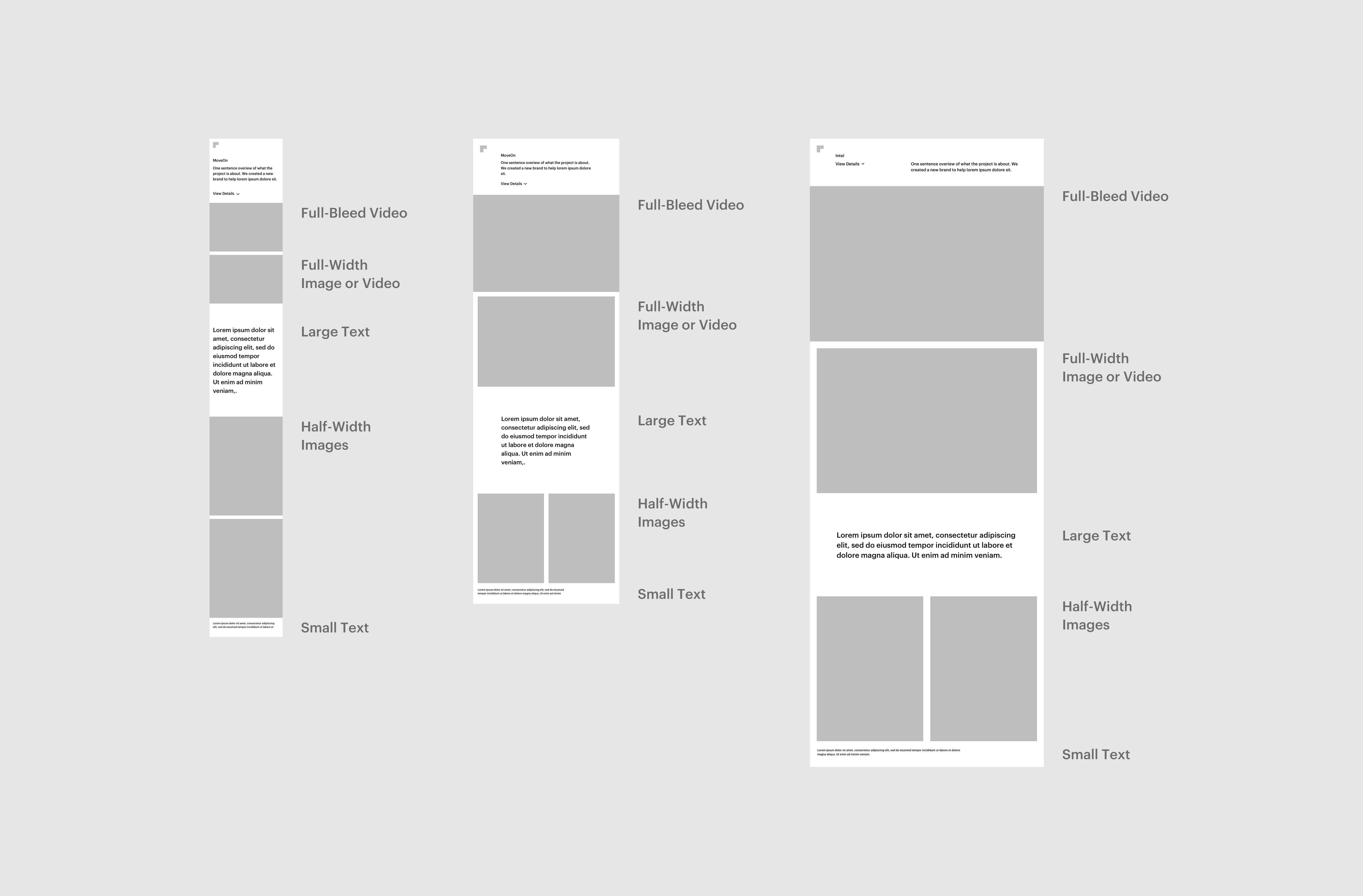
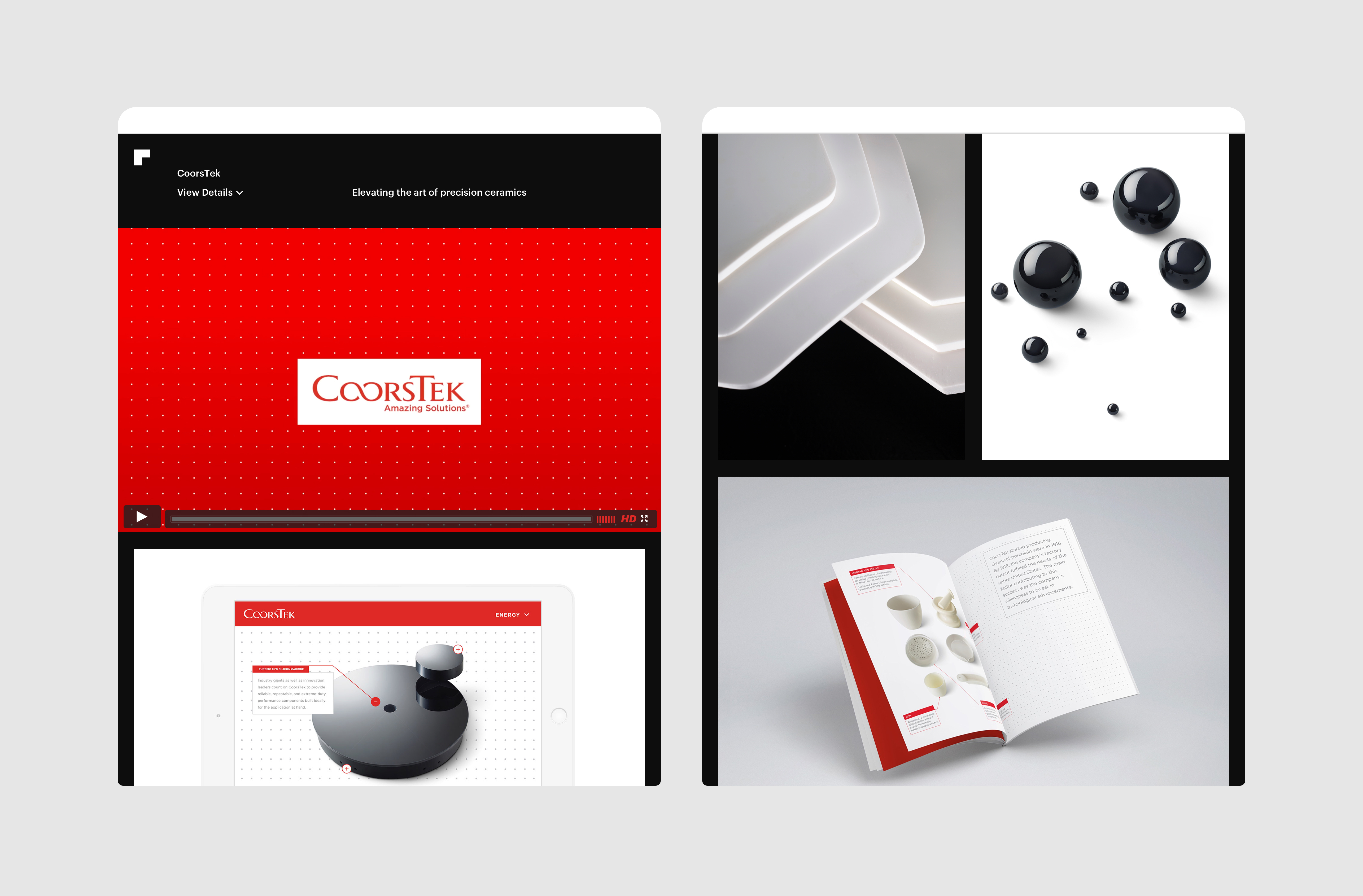
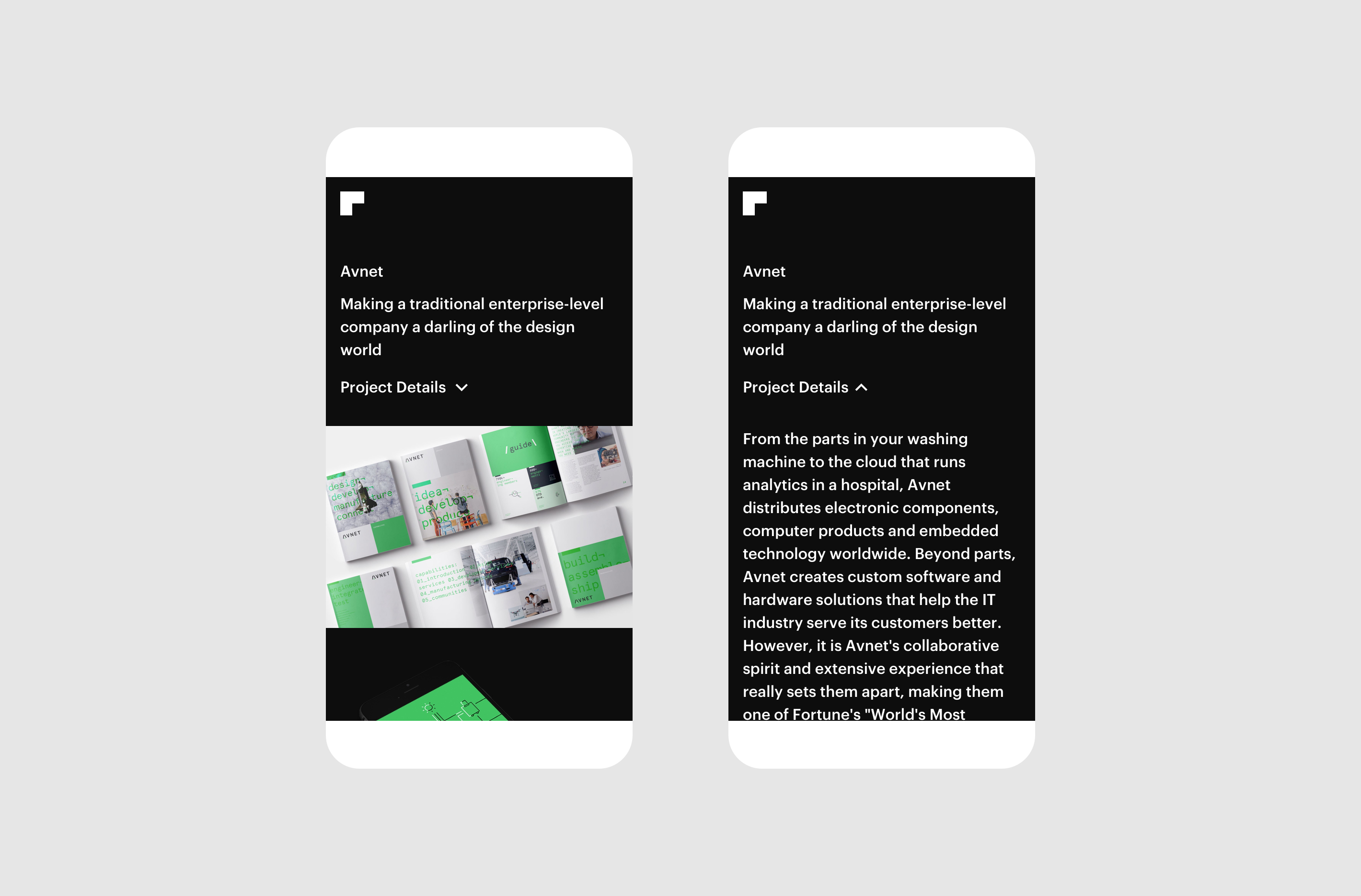
To keep focus on the most engaging parts of a case study, the full written synopsis of each project is deprioritized in a drawer at the beginning of each project.
About - Becoming Acquainted
To give the audience a sense of what make RedPeak unique, information about the company vision and culture is provided the About and Contact sections. These pages help communicate the personality of the agency while also making it easy to get in touch.
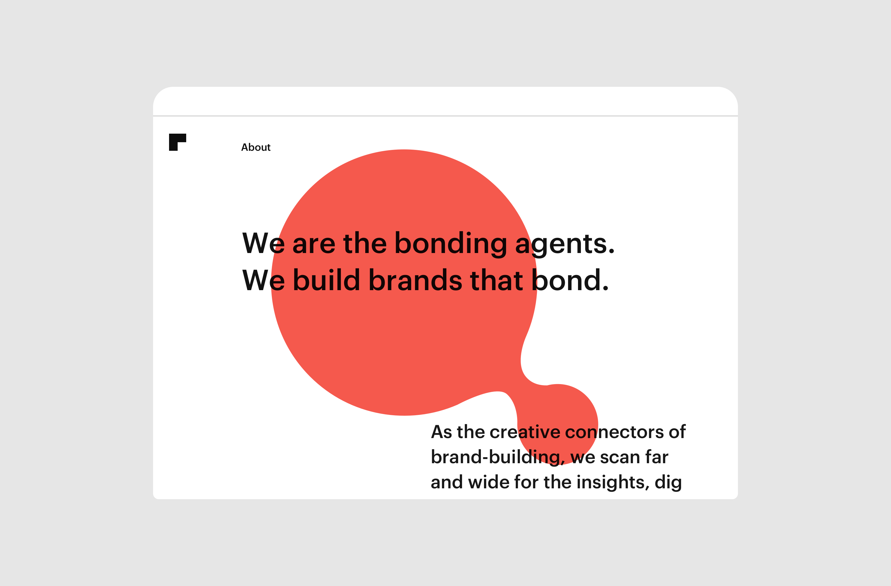
The About page highlights personality, articulating RedPeak's approach to bonding clients with their audiences.
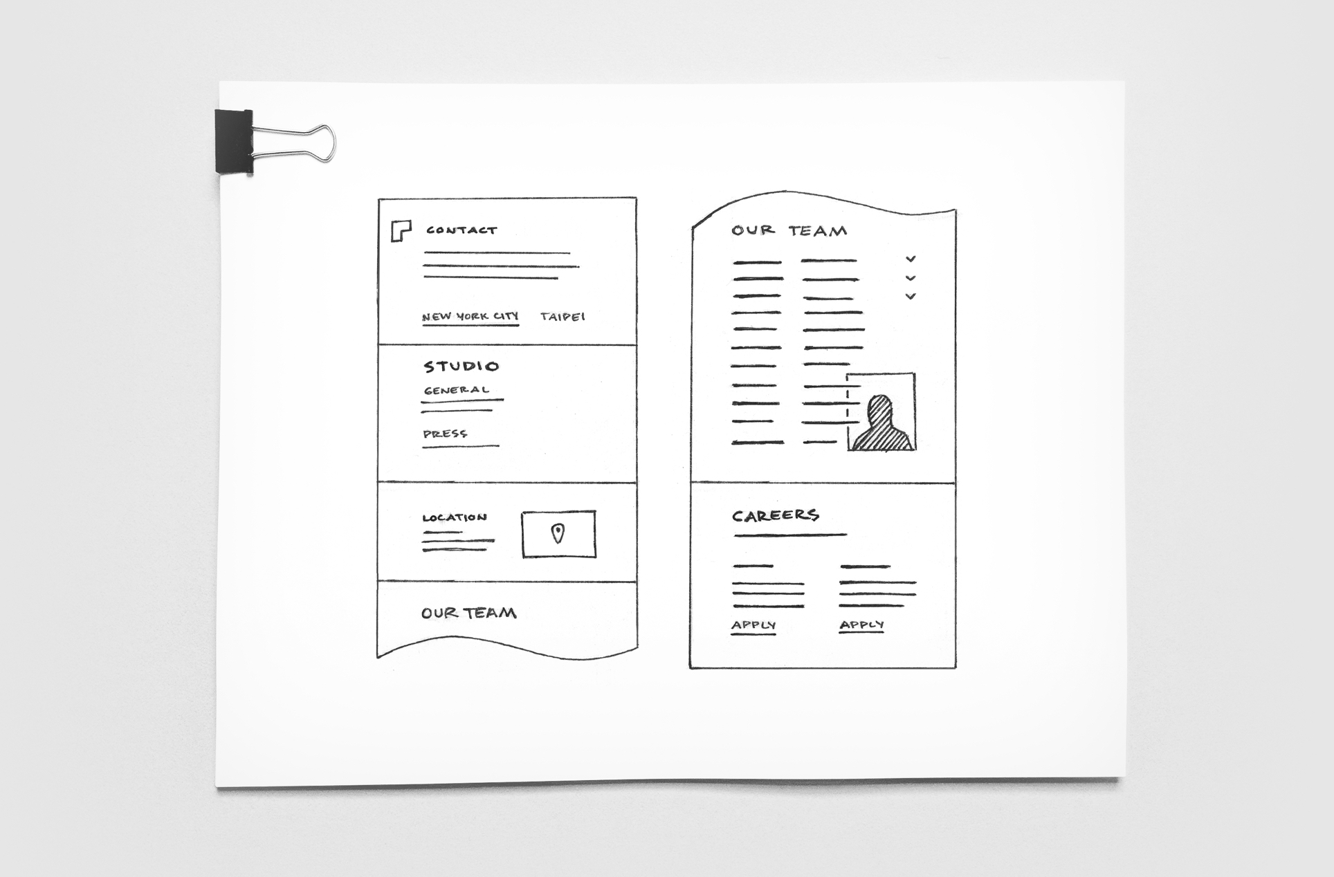
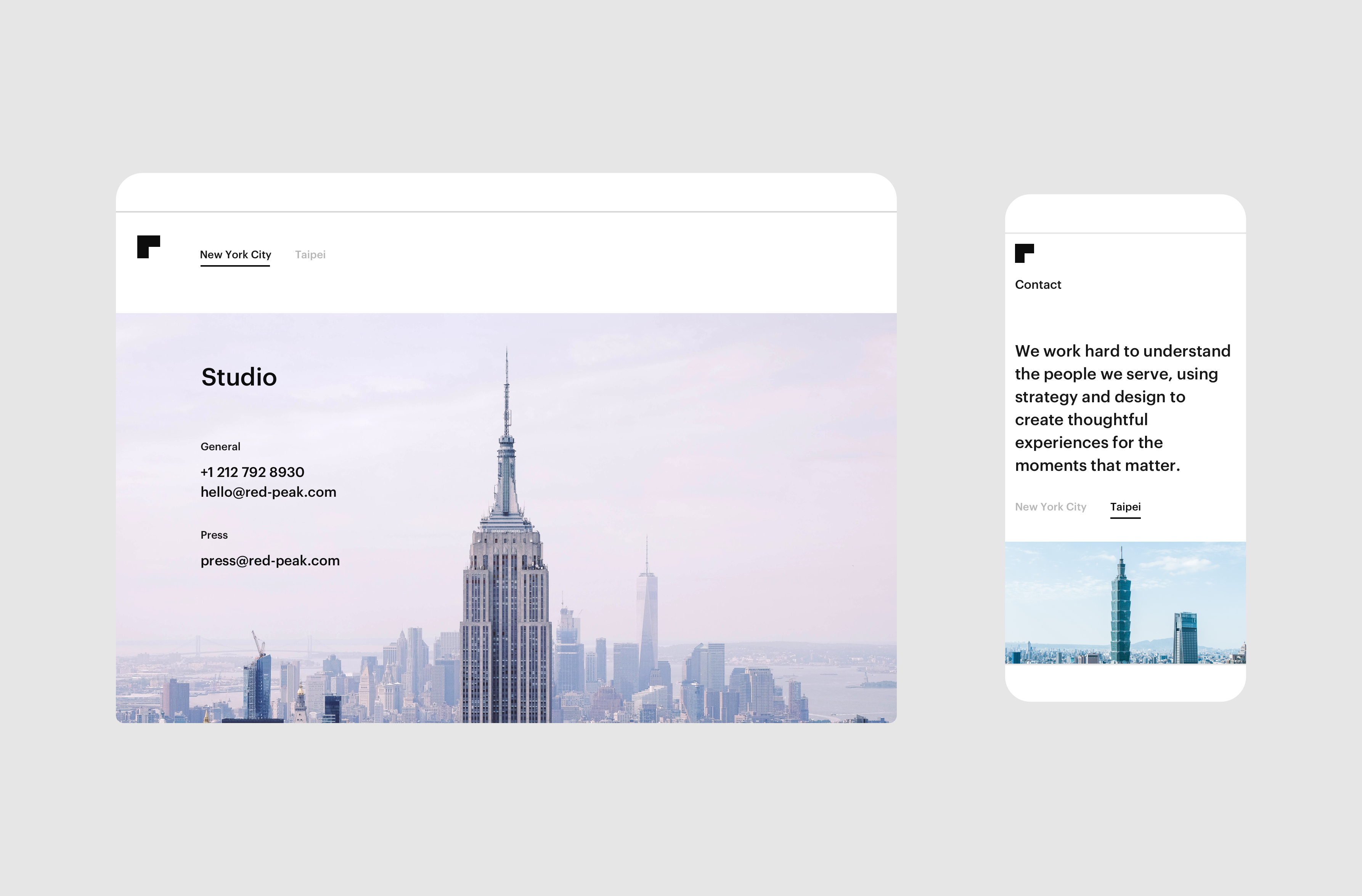
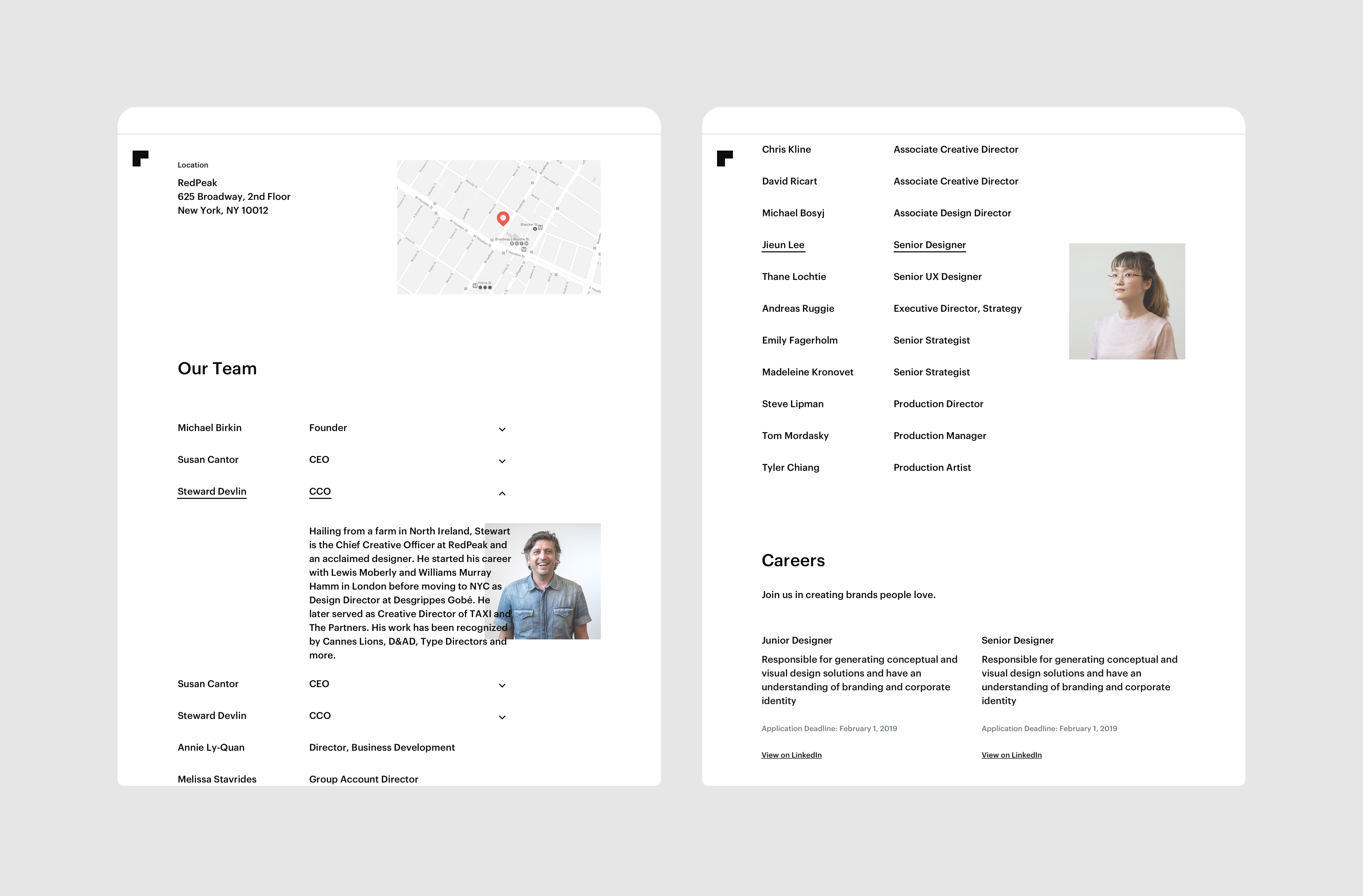
The new Contact page combines the previous Company, People, and Contact pages into a single page. Users can toggle between each of RedPeak’s locations, updating the contact information, staff, and open positions below.
RedPeak’s new site was launched in 2018, giving audiences a curated portfolio with a clear identity and personality that reflects the heart of the organization.
See more at red-peak.com
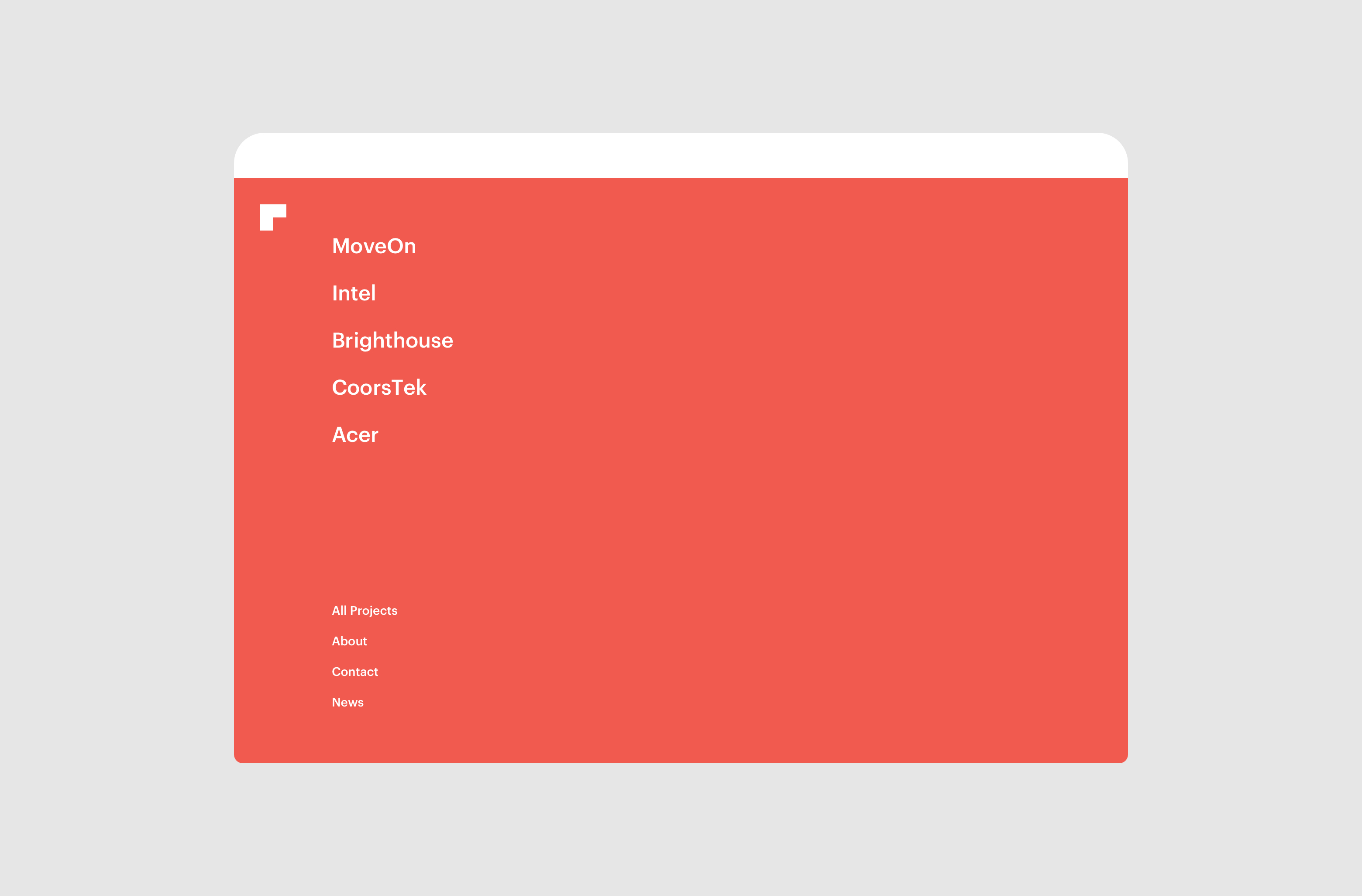
Other Projects