With Xfinity Mobile, Comcast entered a new market with a mobile service focused on easy data management and extensive support. Our team at Citizen designed and developed their new website and app from scratch.
RedPeak is a branding agency in New York and Taipei that was looking for a new website. Their redesign focuses on a more curated approach that shows RedPeak’s best work and highlights their unique personality.
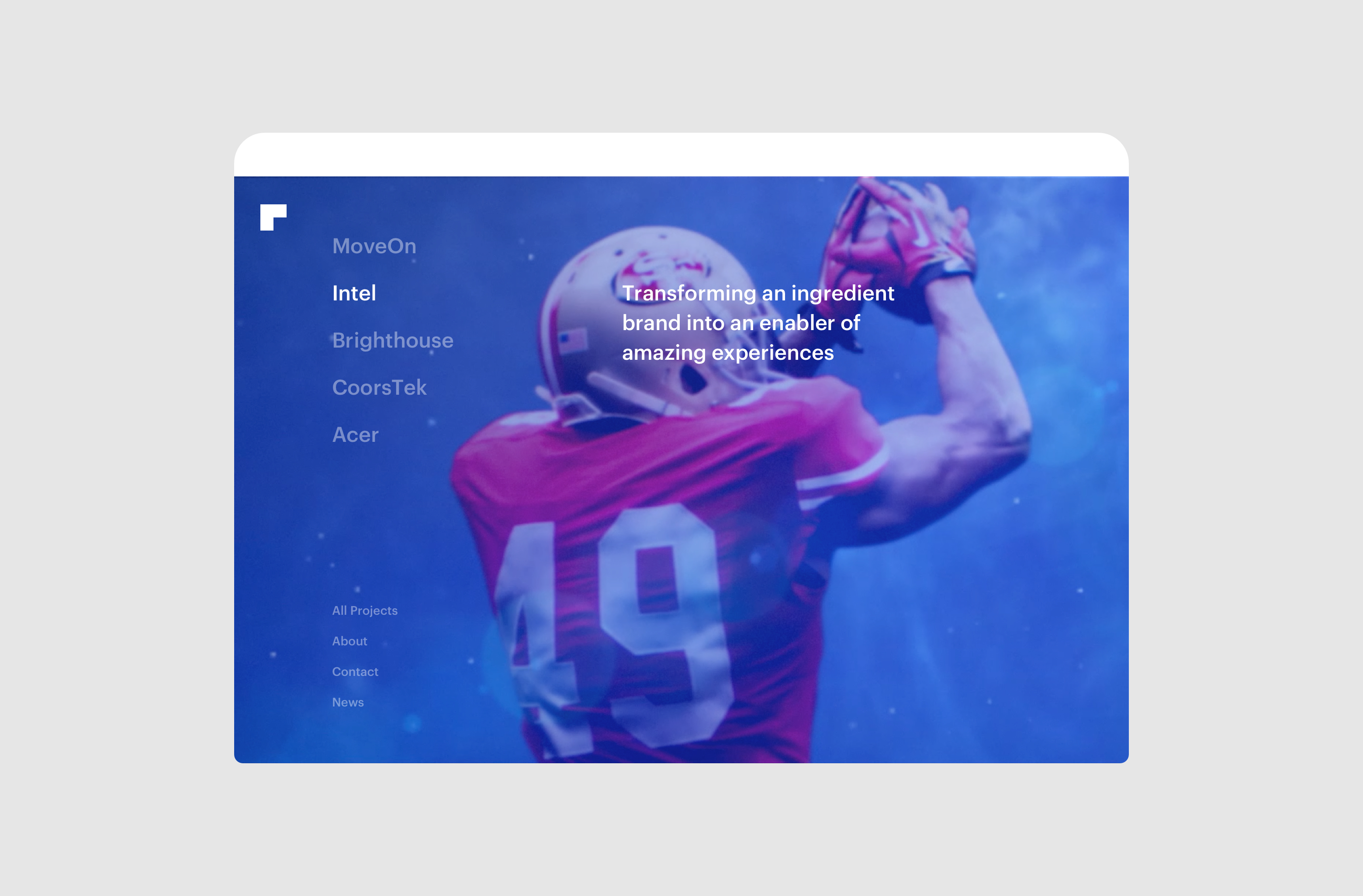
In 2018, MoveOn.org was looking for a brand refresh and a new site. I designed the information architecture and key pages for the site, merging three separate websites into one cohesive home for the nonprofit.
In 2018, MoveOn.org was looking for a brand refresh and a new site. I designed the information architecture and key pages for the site, merging three separate websites into one cohesive home for the nonprofit.
Problem
In addition to introducing a new service, I focused on solving common problems of confusing data, unclear billing, and an opaque and frustrating customer service experience.
Role
As an experience designer, I mapped the user journey, analyzed mobile competitors, helped organize the architecture and page structure, and created concept directions, wireframes, and prototypes of the experience.
Discovery - Outlining the Project
This project began by taking a close look at user needs and how they related to business requirements. Mapping the user journey provided a reference point for how users were thinking, feeling, and acting, and gave context for how to support them throughout their experience.
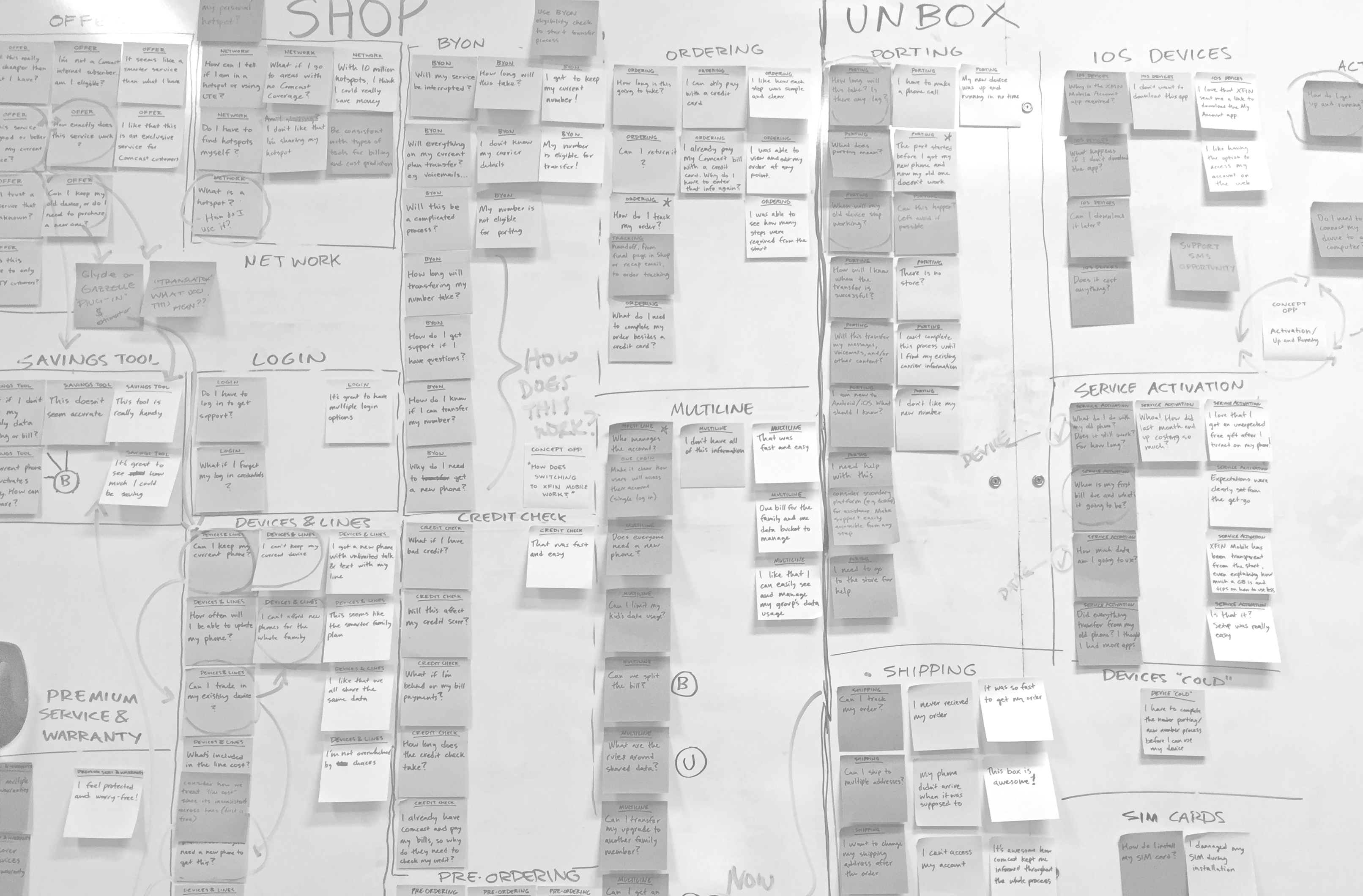
We mapped the user’s journey with a new mobile carrier, noting areas of friction as opportunities for improvement.
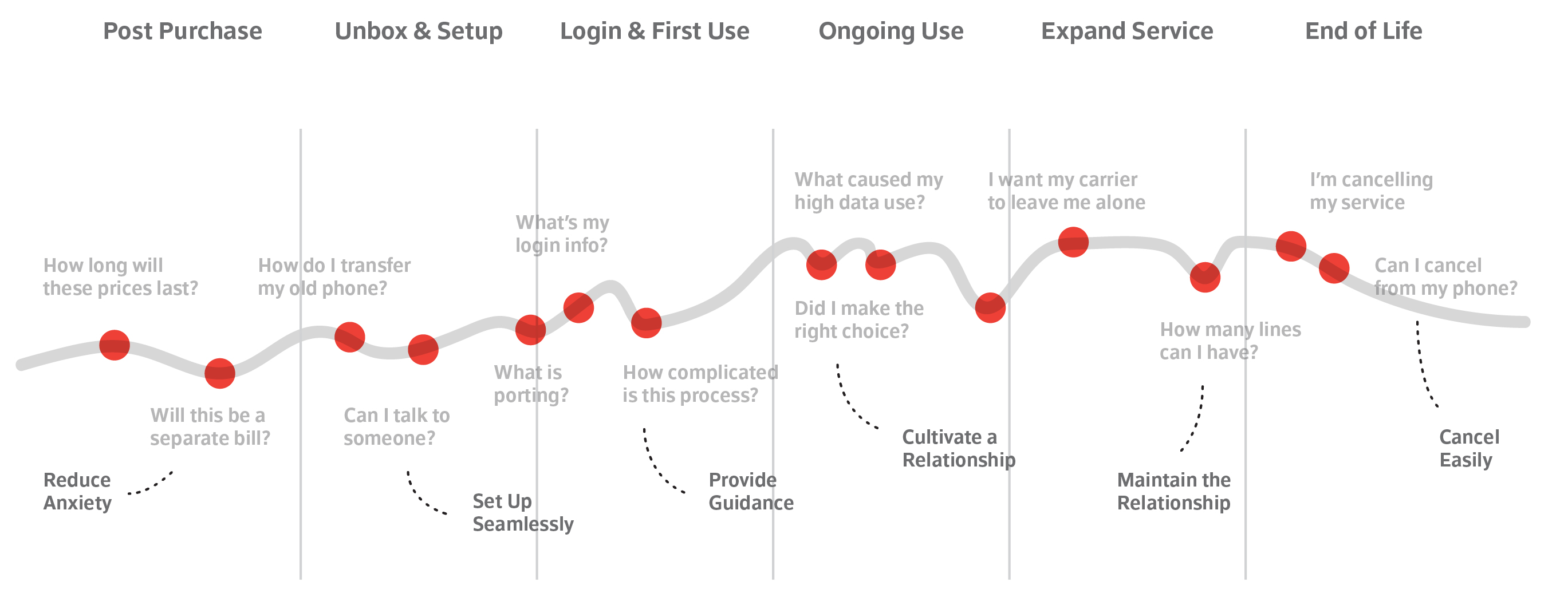
The user journey also informed how we understood and organized the business requirements and how we prioritized content in the information architecture.
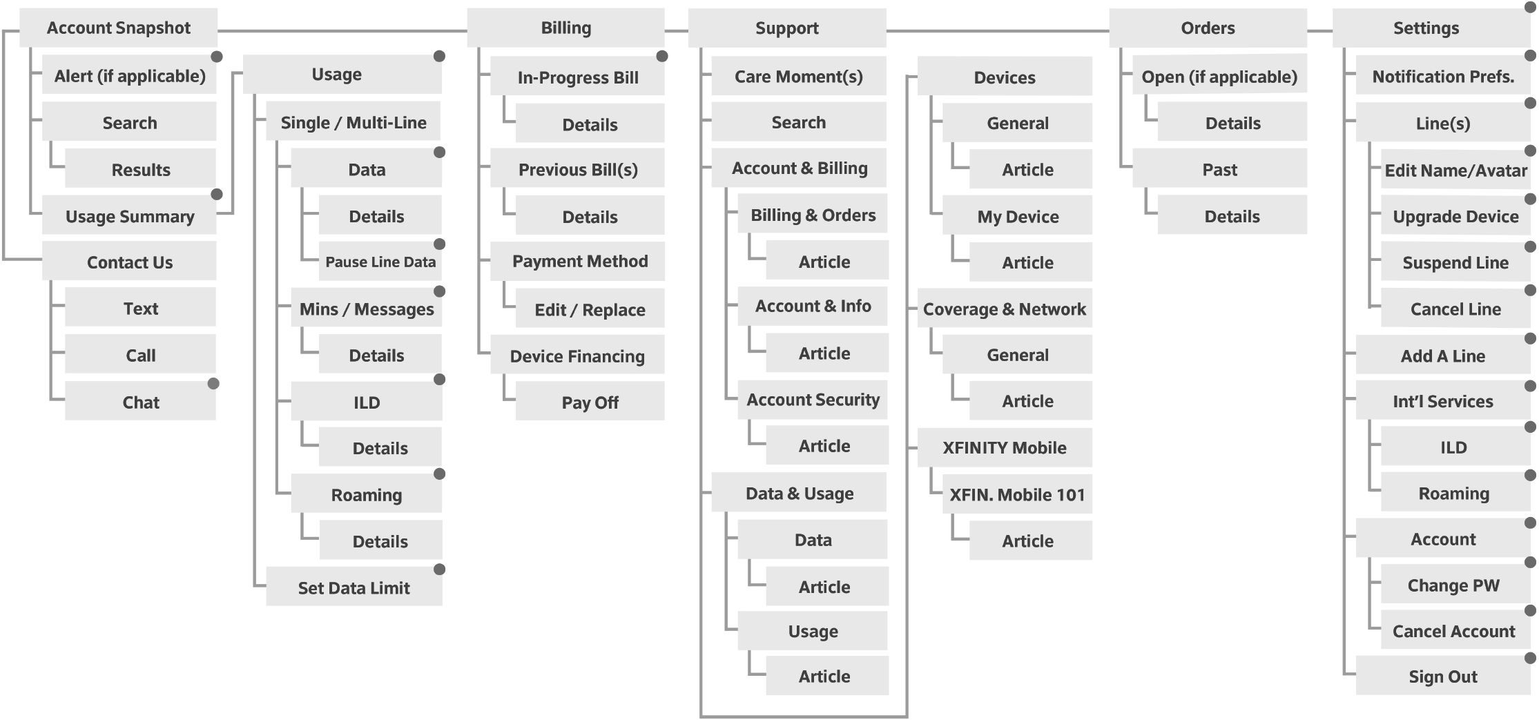
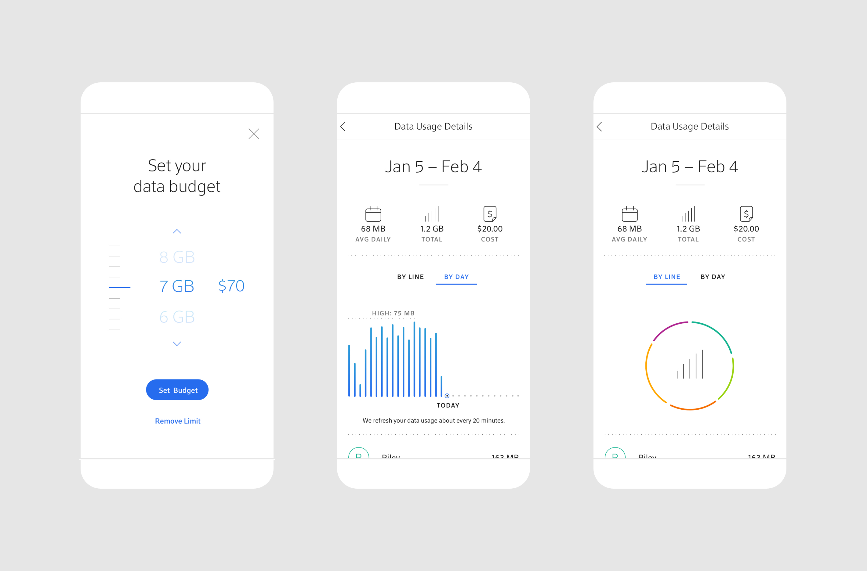
Home - Seeing the Priorities
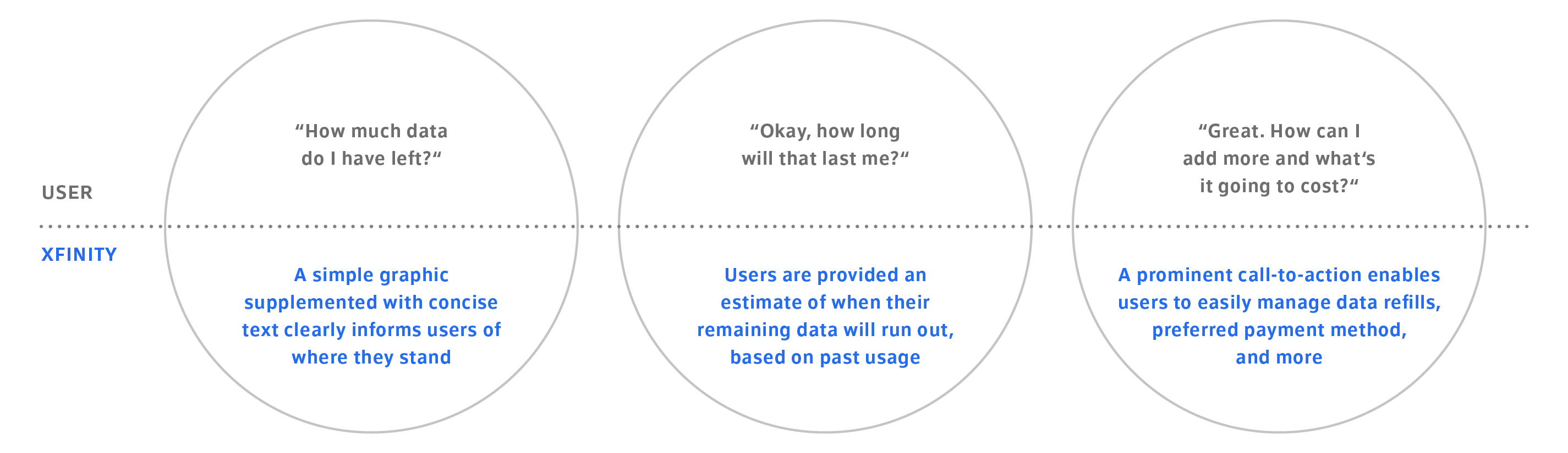
As the homepage of the experience, the account section was a top priority. We translated the architecture into sections of content and considered context for key moments like an upcoming bill or low data.
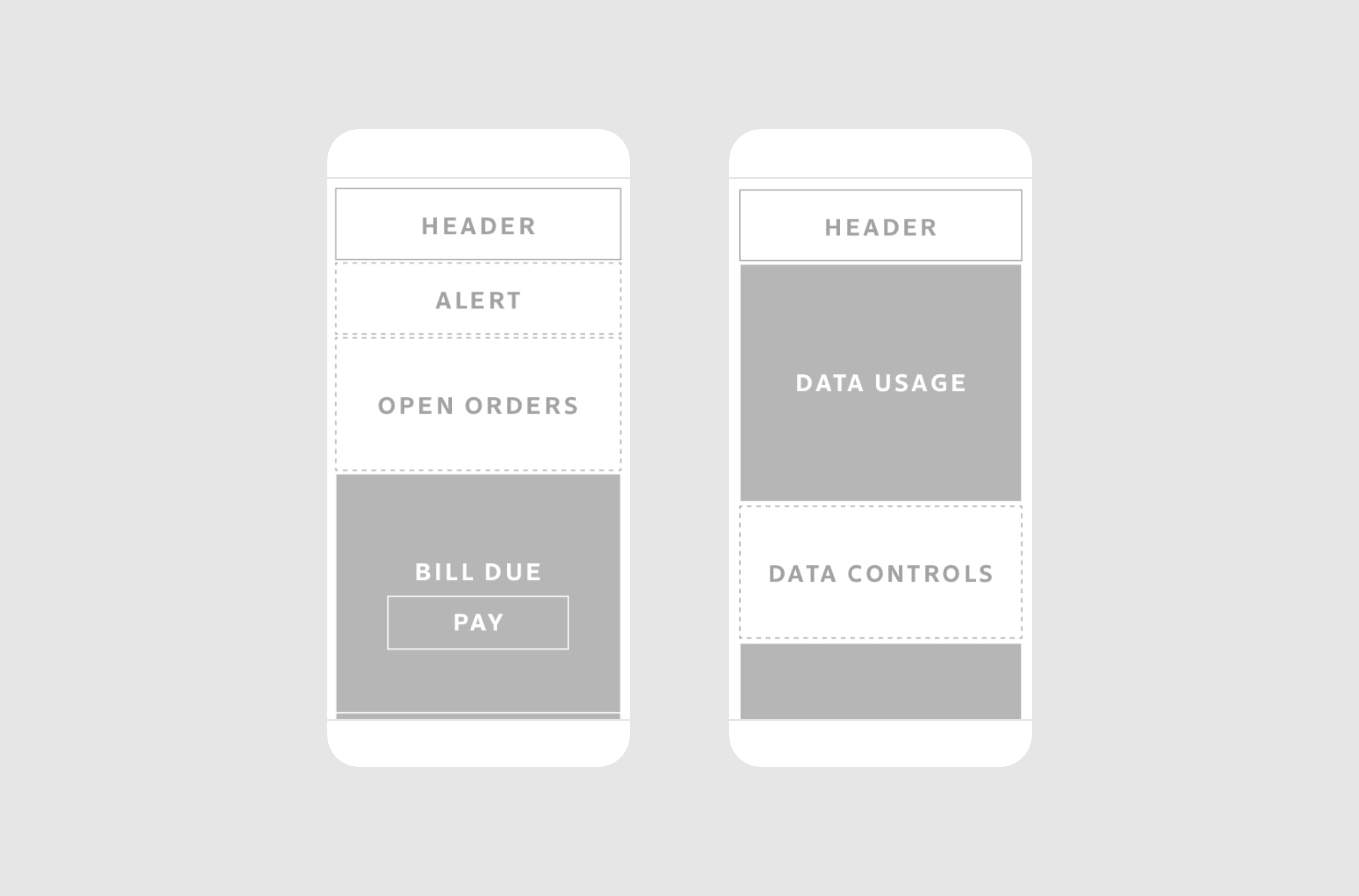
Through testing we uncovered and prioritized top questions people had about their data. This organization informed my concept sketches and wireframes for the homepage design.
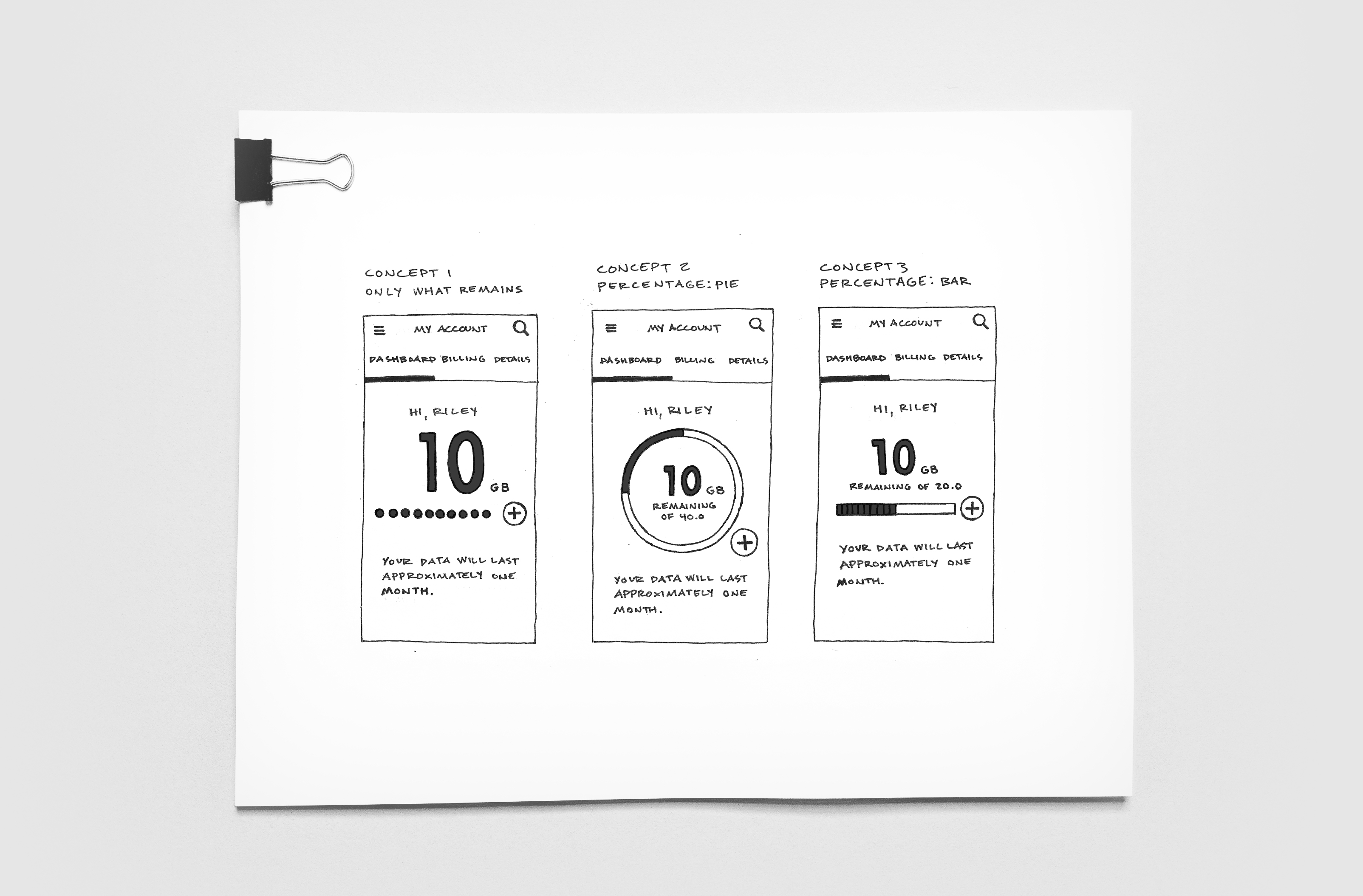
Homepage concepts prioritize remaining data, contextualize it, and make it easy to add more.

The final homepage design leverages the first concept, highlighting only the data that remains to keep things simple.
Support - Meeting You Where You Are
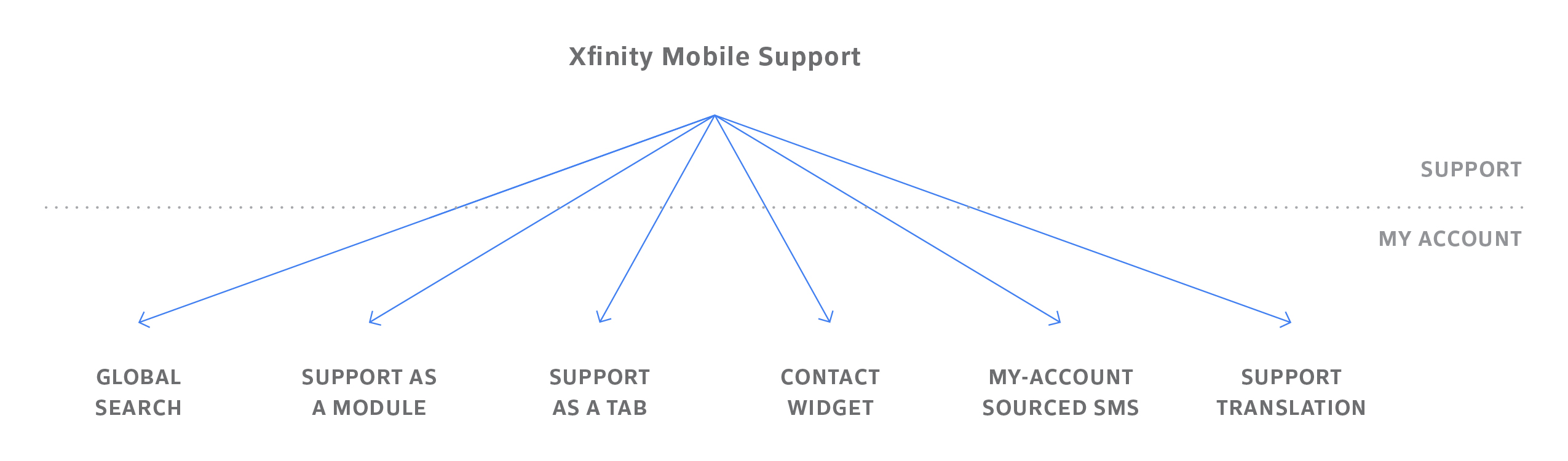
Since customer satisfaction was a top priority for Comcast, we focused on creating a best-in-class support experience. Given the numerous opportunities to provide help throughout the journey, we began to understand support less as a destination and more as a layer across the entire experience.
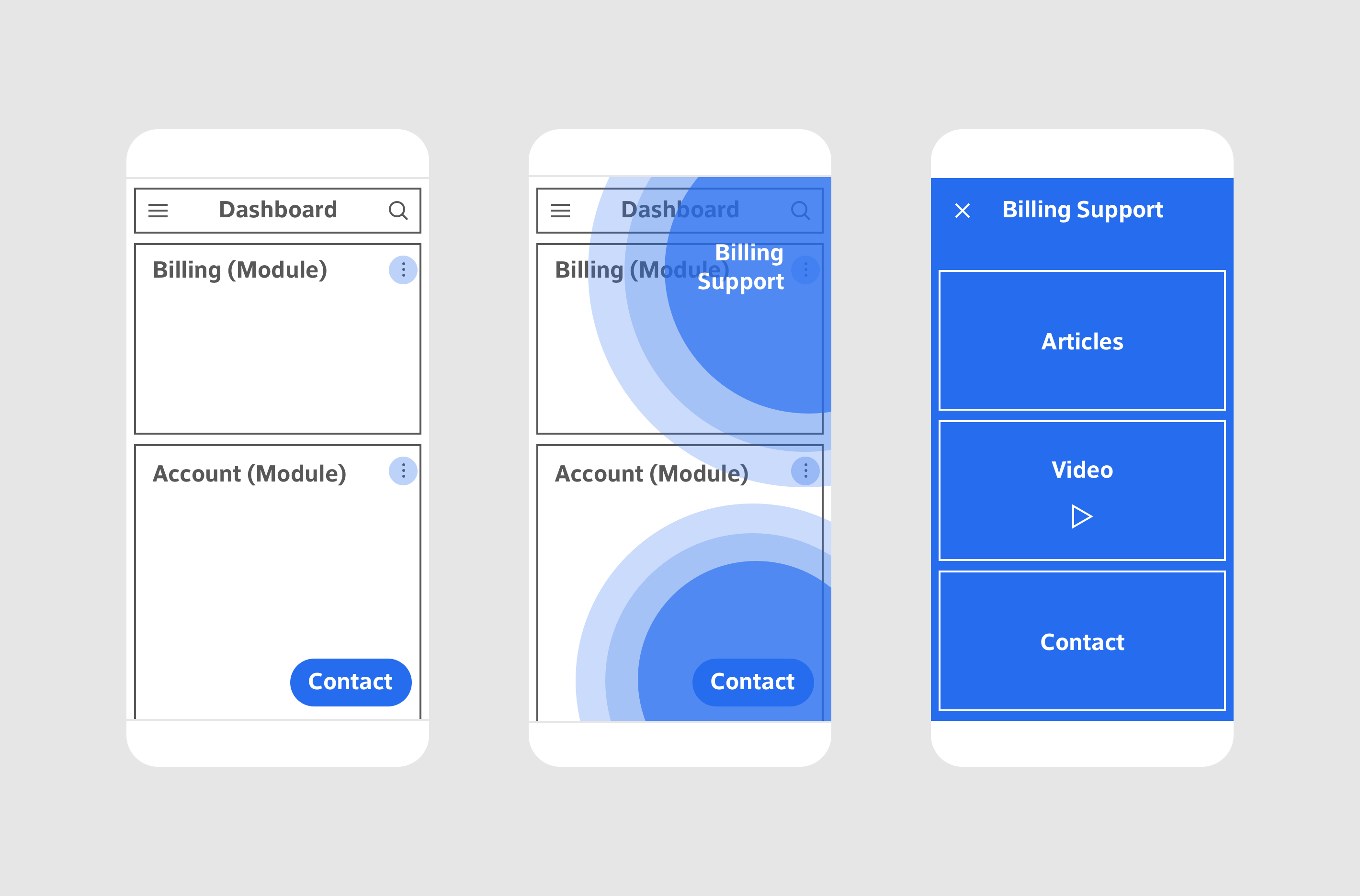
Early concept wireframes demonstrate how help can appear as a layer, providing contextual support that’s specific to the user's place in the experience.
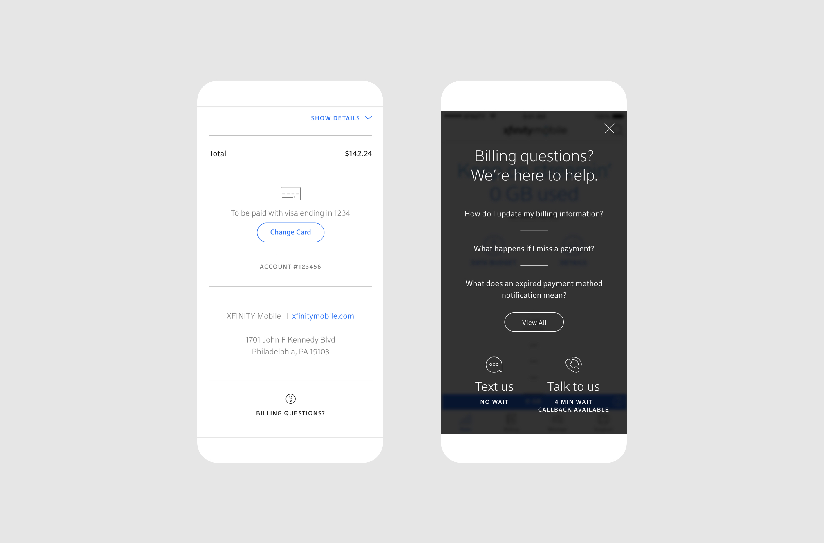
Final visual designs show how contextual support comes to life in sections like Billing.
Support content is incorporated contextually in every section, allowing users to move quickly from encountering an issue to reaching a resolution.
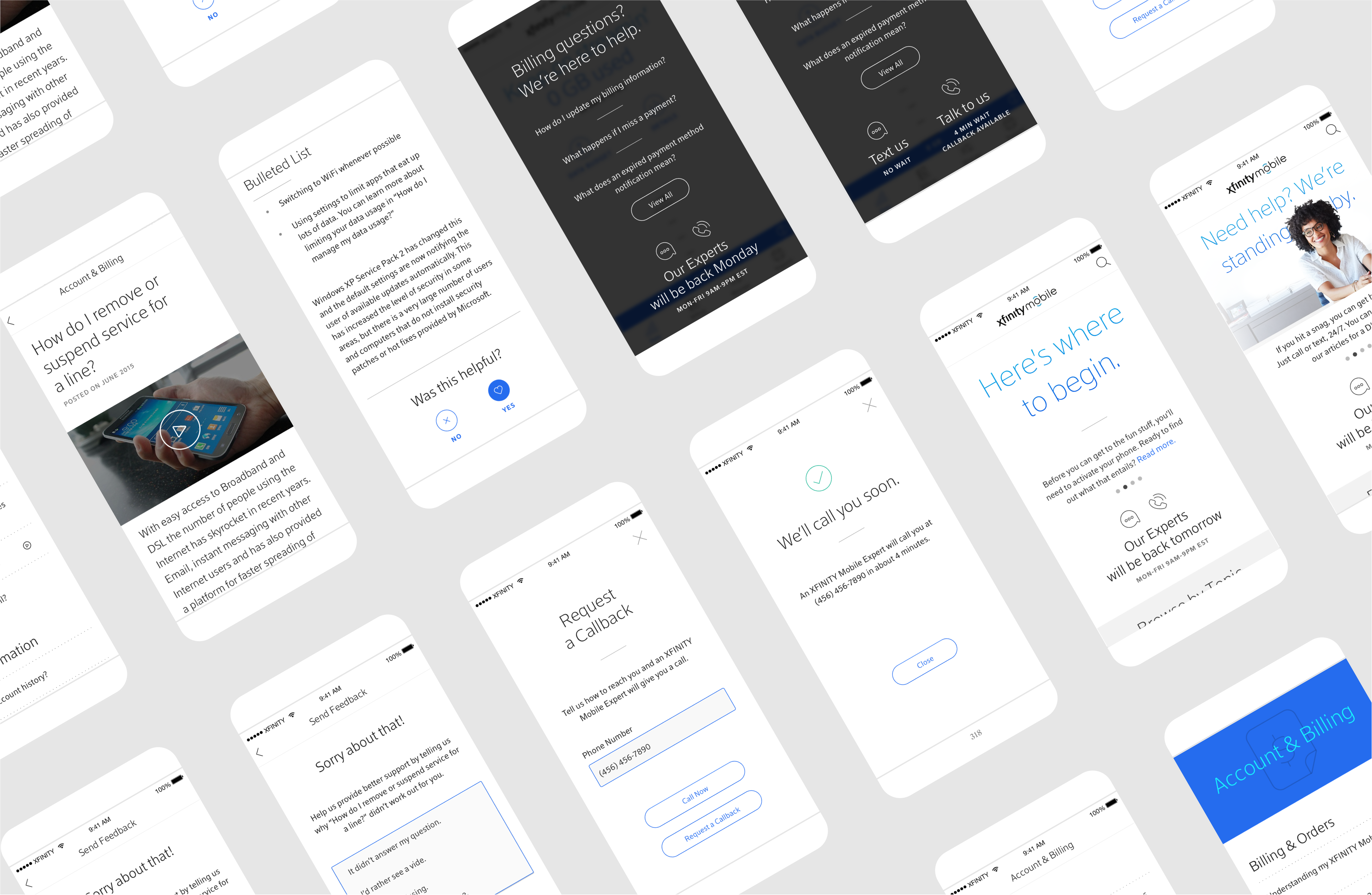
Examples show the variety of locations and contexts for support.
Xfinity Mobile was launched in 2017 and now boasts over one million users on the largest network in the nation.
See more at xfinity.com/mobile
Other Projects